
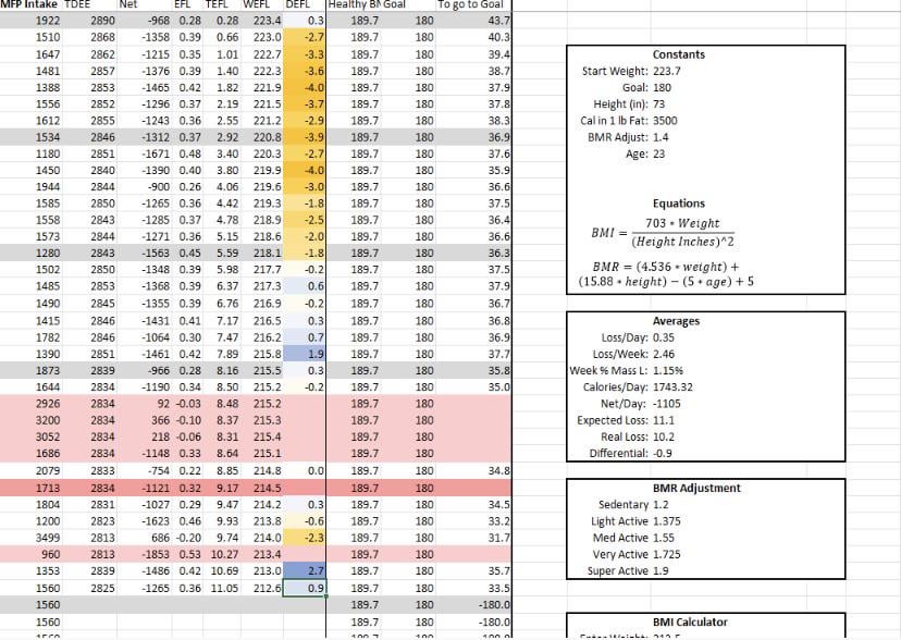
So I keep an excel of my weight loss to keep me honest with my weight loss, and honestly because I am a nerd for this sort of shit. I recently did an analysis on the difference between my actual weight, and the weight loss expected from my calorie deficit, and had some interesting results! The yellow shows when I am peeing out a bunch of weight, but it’s not from fat loss because my calorie deficit literally could not be that much fat. The blue shows when I am holding onto some water weight, whether it’s in my muscles due to lifting, or because of a high sodium/carb day. You’ll notice that in the first two weeks it’s all SUPER yellow, showing that initial water loss we all talk about, but by two weeks in, it tapers off and my expected fat loss has completely caught up to my actual weight! Just kind of a cool nerdy observation I thought I’d share🤓
by DeliciousSandman
2 Comments
I love the yellow and blue color coding.
I also take any opportunity to work with some data!
Can you define your column variables at the top? This is awesome