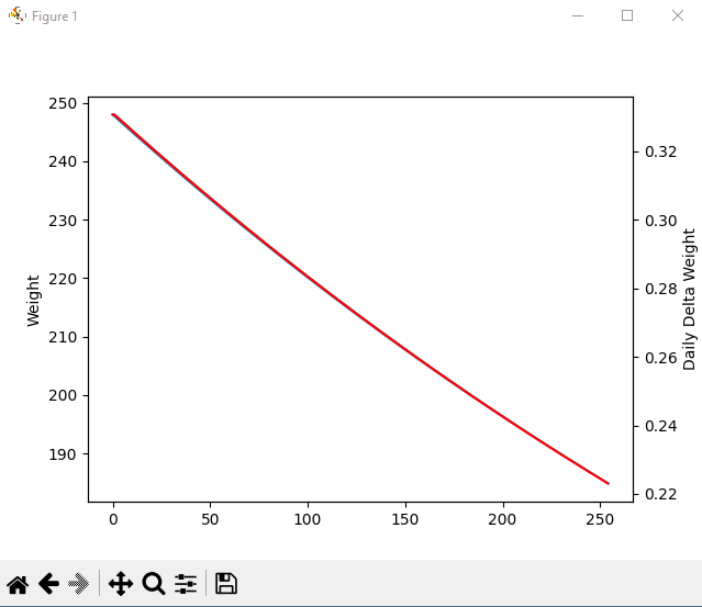
Graph of predicted weight loss at 1500 calories showing predicted daily change in weight over time.
Graph of predicted weight loss at 1500 calories showing predicted daily change in weight over time.
by MapProfessional8610
2 Comments
MapProfessional8610
This is based on a 23 male with activity level 1.2 times BMR as calories burned daily. This graph shows both the weight on every day, and how much weight you are expected to lose every day, with 2 lines representing each. Left is weight, bottom is time in days, right is delta weight in pounds. The thing I found really interesting is that both lines appear to have the same slope/curve, so as you loose weight you proportionally lose less weight each day. As you can see, the predicted daily weight loss towards the end can be 33% less than what you start out with.
TheBigBo-Peep
Cool data!
I want to note though, this is for a very big calorie deficit. So big that many people, especially women (thanks to lower metabolic burn) would have a hard time making it happen.
I do love this sub, but for somebody burning that many calories, going closer to 1600/1700 may be more sustainable and even healthier.
That especially shows in how steep this line is without flattening much. Usually a real weight loss experience that lasts that long will either need to be adjusted in increments or flatten out some thanks to your body becoming less energy hungry / more efficient.

2 Comments
This is based on a 23 male with activity level 1.2 times BMR as calories burned daily. This graph shows both the weight on every day, and how much weight you are expected to lose every day, with 2 lines representing each. Left is weight, bottom is time in days, right is delta weight in pounds.
The thing I found really interesting is that both lines appear to have the same slope/curve, so as you loose weight you proportionally lose less weight each day. As you can see, the predicted daily weight loss towards the end can be 33% less than what you start out with.
Cool data!
I want to note though, this is for a very big calorie deficit. So big that many people, especially women (thanks to lower metabolic burn) would have a hard time making it happen.
I do love this sub, but for somebody burning that many calories, going closer to 1600/1700 may be more sustainable and even healthier.
That especially shows in how steep this line is without flattening much. Usually a real weight loss experience that lasts that long will either need to be adjusted in increments or flatten out some thanks to your body becoming less energy hungry / more efficient.