

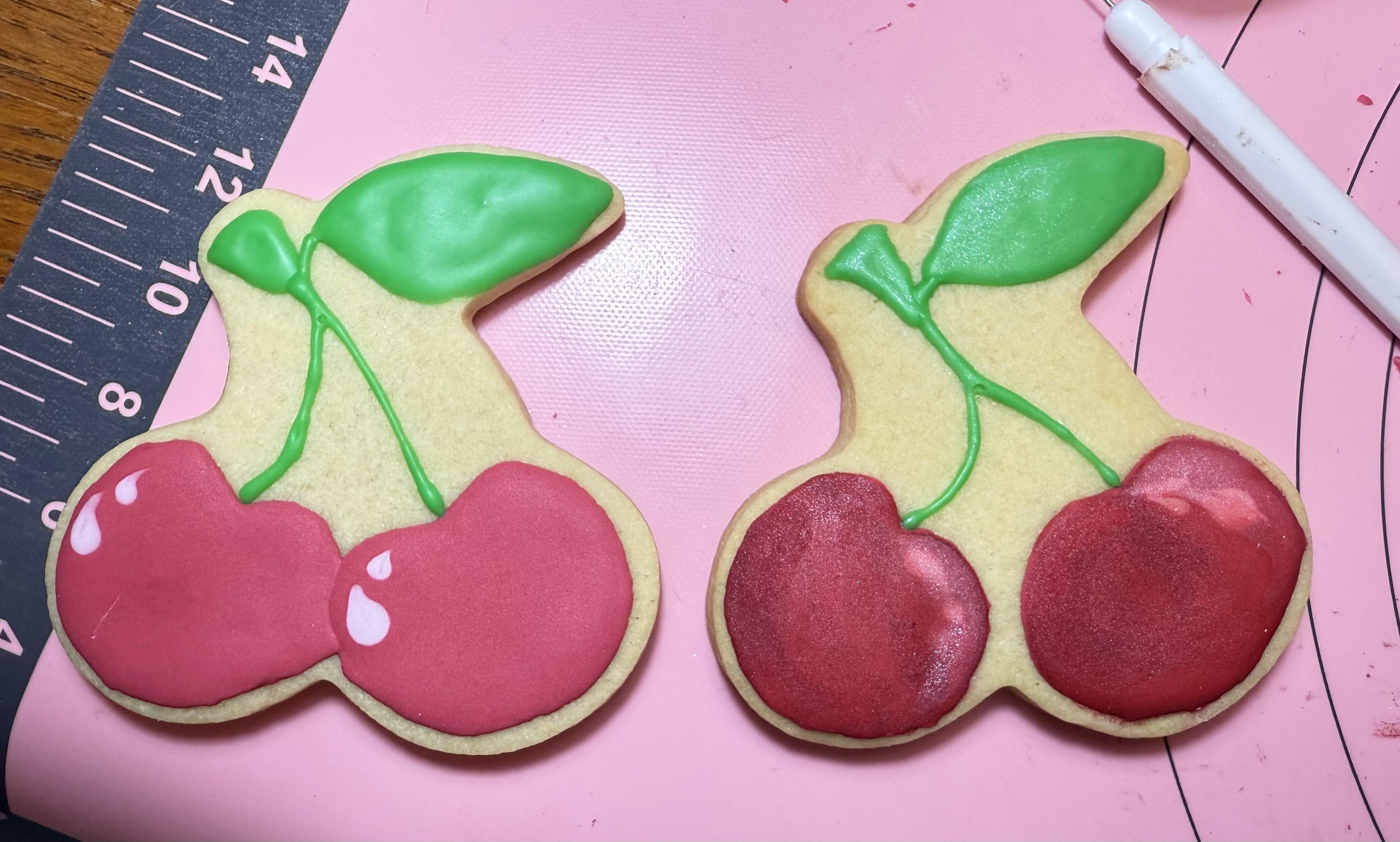
I can’t tell if I’m being too critical or not critical enough. They’re not clean and perfect but I’m just starting to decorate cookies (for fun just for my family and get together with friends!)
Are these ok? And which is better? Left or right? Right has red luster dust on it to make it sparkle a bit, but dulls the white reflection spots (which I know aren’t good looking anyway!)
So which is better? And how can I improve? My green was a bit off in consistency but I didn’t want to make more right since these are just for playing!
by Intelligent_Fish3728
12 Comments
I like the left better personally, but for your first attempt I think they look great! How do you know if you like it or not if you don’t try 😊
Sorry. Don’t know how to improve since I just come here to see what people make. But just wanted to say you’re doing a great job and to keep it up! I like the left one a little more just because it’s lighter, but that’s just me. Wish I knew how to make something like this ☺️
I like the depth of the one on the right
Tips : don’t mix your royal icing too long, use two consistency for a cleaner look – this will also help if you start doing a lot of quantities. You can make a stiffer icing (look for a Dairy Queen swirl when you lift your spatula), outline & then fill. I know it seems like a lot of work to do consistencies but it pays off. You just make your stiffer icing first & then loosen it for your flood icing
I think they both look great. Right has more of a realistic cherry color and the left is super cute and cartoonish. Can’t go wrong either way, just depends on what you’re going for.
If you have the time I would do a white royal icing layer underneath – let it dry – and then add the cherries on top to make them pop more. They both look great! Depends on the look you’re trying to achieve…
They’re quite charming. I think the one on the left is more effective.
I love the lines on the right one, but the white spots on the left one do it justice. Maybe do the white dots on the right? They both look good just being the perfectionist I am, that’s all I see. I hope it helps! Good job though!
Both are good, I prefer the right as they look more realistic
I like the left as they pop more, but that could also be skewed bc I don’t see as much of the luster on the right.
As far as tips, I’d say maybe making the icing a toooouch thicker, so you get more volume out of it. You may have to use a scribe or toothpick to even it out, but I think you’ll be happier with, say, the leaves if they’re not laying as flat as the stems (or maybe even making a really thick consistency and using a leaf tip – just changing up texture can make a huge impact!) Otherwise it’s just trial and error/getting comfortable with consistencies and flows, etc. They’re looking great!
Left is better
I like the stem on the right & the cherries on the left
A very good start!