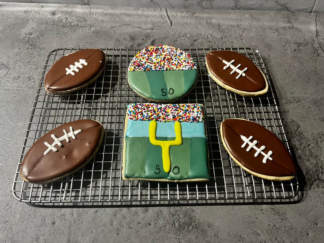
Everyone was so helpful with my last set giving feedback. This is another practice set and I would love to have some feedback on how I can make them better.
End goal: to sell cookies!
by Pdjingle
4 Comments
Madrock24
I’m too much of an amateur to critique your cookies, I think they look great but here is what I can offer.
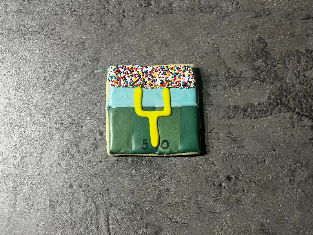
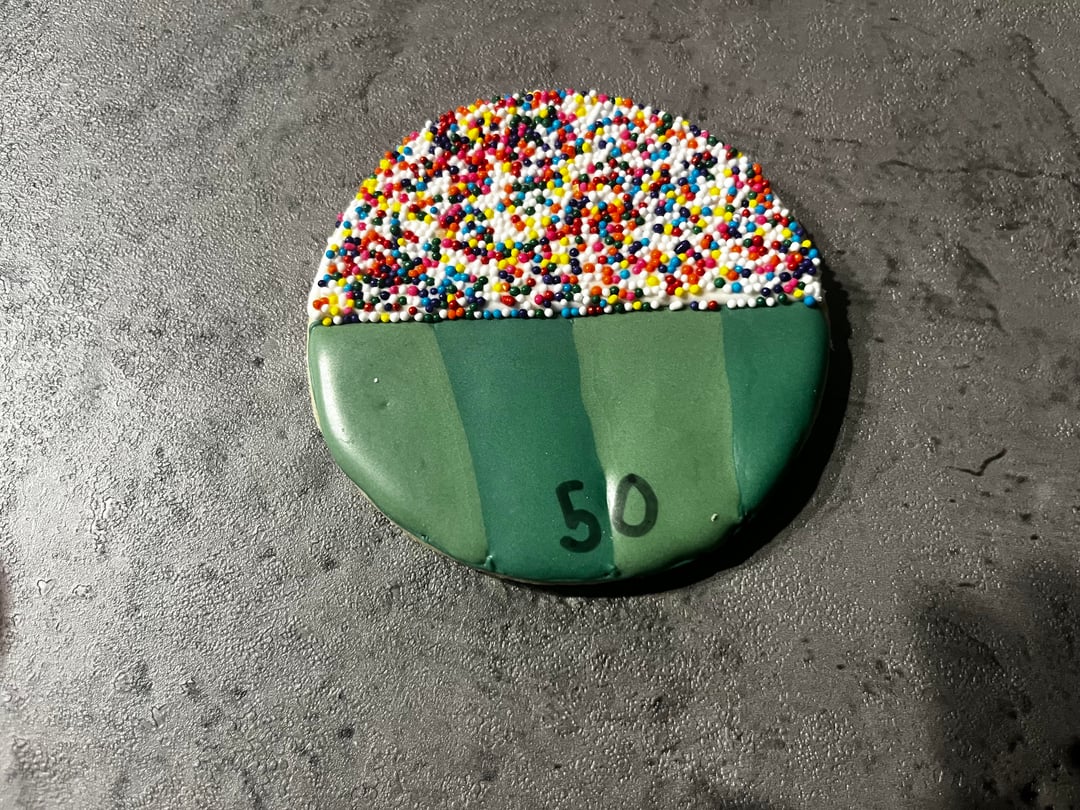
For design if you want realism, in the goal post one, get rid of the light blue color or leave just a thin line to separate crowd from ground and pull the sprinkles down. The vertical strips -remove and make horizontal (one light green for the end zone, darker for contrast/depth) and remove the “50” as those two wouldn’t be seen naturally in the same view. On both field cookies, you could add a small white lines to show contrast like the fields have.
I think it would be super cute if you added a tiny little football flying in the air! You can make them as a transfer or put directly on. “Melted in” or the 3d look would both be cute.
Whoever these are for, I think they will love them as these are anyway. Good work OP!
loulouruns
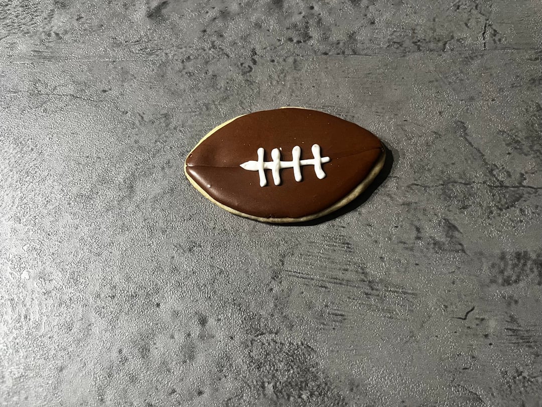
Keep practicing! These are not bad at all, and you will get better and better with each set. As for an actual critique to help you improve, I noticed that some areas of the icing are bumpy. This is likely because your flood was too thick. You’ll get a smoother result if you thin it out just a bit more!
nunya_buisnessfucka
By no means am I a professional yet either but it looks just a bit like your icing might be a little thin for line work and flooding. Thickening it up just a tad will give you some more control on keeping your lines straight and the design crisp
Kai-xo
You want the lines on the fields to not be straight up and down, they have to be slightly angled to the horizon line, to make them look more realistic. Center line is straight then to the left and right you want them more diagonally, if that makes sense. If I could post pics in comments I’d show you what I mean but I can’t 😅 also make those lines white like they are on the field.
The blue behind the goal post is too large as well for perspective compared to the size of the post. So maybe just focus on detail, and adding those. Making sure to not over mix or under mix your frosting. I can see the dye swirling in the frosting, not sure if that was intentional.
Hope this helps!
Edit: just noticed to you have the field going the wrong way in the goal post cookies, normally they would go perpendicular to the post not parallel😊

4 Comments
I’m too much of an amateur to critique your cookies, I think they look great but here is what I can offer.
For design if you want realism, in the goal post one, get rid of the light blue color or leave just a thin line to separate crowd from ground and pull the sprinkles down.
The vertical strips -remove and make horizontal (one light green for the end zone, darker for contrast/depth) and remove the “50” as those two wouldn’t be seen naturally in the same view.
On both field cookies, you could add a small white lines to show contrast like the fields have.
I think it would be super cute if you added a tiny little football flying in the air! You can make them as a transfer or put directly on. “Melted in” or the 3d look would both be cute.
Whoever these are for, I think they will love them as these are anyway. Good work OP!
Keep practicing! These are not bad at all, and you will get better and better with each set. As for an actual critique to help you improve, I noticed that some areas of the icing are bumpy. This is likely because your flood was too thick. You’ll get a smoother result if you thin it out just a bit more!
By no means am I a professional yet either but it looks just a bit like your icing might be a little thin for line work and flooding. Thickening it up just a tad will give you some more control on keeping your lines straight and the design crisp
You want the lines on the fields to not be straight up and down, they have to be slightly angled to the horizon line, to make them look more realistic. Center line is straight then to the left and right you want them more diagonally, if that makes sense. If I could post pics in comments I’d show you what I mean but I can’t 😅 also make those lines white like they are on the field.
The blue behind the goal post is too large as well for perspective compared to the size of the post. So maybe just focus on detail, and adding those. Making sure to not over mix or under mix your frosting. I can see the dye swirling in the frosting, not sure if that was intentional.
Hope this helps!
Edit: just noticed to you have the field going the wrong way in the goal post cookies, normally they would go perpendicular to the post not parallel😊