Also those look terrible and thin. They seem like the kind that slide all over the counter.
Odd_Cress_2898
Is your boyfriend color blind?
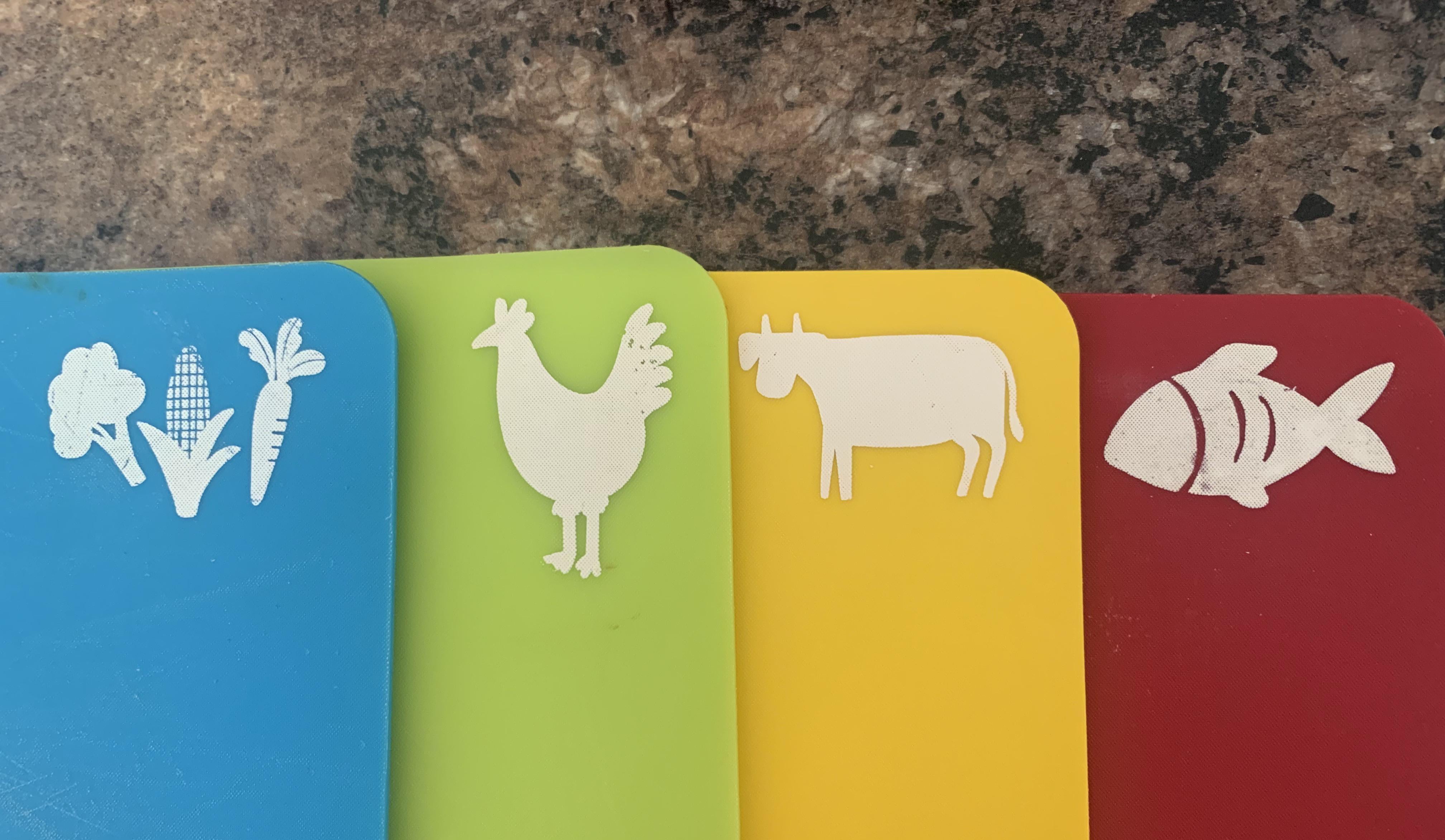
* Blue – fish * Green – vegetable * Orange – chicken * Red – beef
(From a non-pro in the UK)
Edit: if there was supposed to be a difference between raw and cooked meat, there should be steam coming out of a cut of meat with grill marks on it
DoubleTheDutch
All the color associations are wrong lol
Royal_Succotash_420
Holy shit I thought this was r/mildlyinfuriating at first!
Coercitor
I’m offended they put a cock on the board and not one with a clam.
AZBreezy
This feels like a prank gift
WhimsyWrites
I have that same set! It makes me genuinely crazy everytime.
CoppertopTX
So, is the reason the irritatingly thin plastic that will end up in everything prepped on those or the completely bonkers color coding?
My husband, bless his heart, bought me a set of those when we got our first place together. They became placemats.
fbp
Weird knowledge that I have on this. the current system seems to be finally standardized, but over the years, many different color charts were used. I looked it up at one point because I definitely remember certain colors were for other things. Early 2000s brown was for raw unwashed vegetables. Yellow was for cooked chicken and meat. Red was for raw meat and chicken(poultry).
One chart I found had yellow used for fruit, and one company that I worked for recently used that system.
End of day, as long as you adhere to the same system with the boards you got. That’s all that really matters.
One-Adhesive
People are using dofferent cutting boards for chicken and beef? Is that a religious thing?
OMeffigy
I hate it. Chicken is yellow, veggies are green, beef or pork red, seafood blue
Battleboo_7
Why the fuck isnt green for veggis blue for fish red meat on red board please ELI5
This is the visual equivalent of nails on a chalkboard.
jacksonmills
It’s like they tried to completely fuck it up. None of these are accidentally right either.
BetterBiscuits
Blue = Fish, Green = Veg, Yellow = Chicken, Red = Beef. Come on people.
ThrorOak
Give that to chives guy.
kingofphilly
Here’s the problem when people know you cook or whatever. *All* of your gifts become cookbooks or shitty cooking related stuff. It’s the thought that counts, I get it, but I don’t want a Five Below cutting board or a ceramic knife block.
Stop getting me useless cooking shit!
SpicyWokHei
I used to have these in my first shitty apartment. They are as cheap, and shitty, as the apartment was.
I have these. The white for the icons peels off fyi. They are fine but probably lots of microplastic. I sometimes use on top of a bamboo to quickly gather ingredients.
MobBossVinnie
The icons dont match the colours, beef should be red, fish blue, veggies green, chicken yellow.
Kickinitez
Looks like a good way to consume more microplatics
blacfd
No. That’s all wrong. Everything is wrong.
dragonaut47
… if you shift everything one to the right then it’d be visually ok I guess


30 Comments
Also those look terrible and thin. They seem like the kind that slide all over the counter.
Is your boyfriend color blind?
* Blue – fish
* Green – vegetable
* Orange – chicken
* Red – beef
(From a non-pro in the UK)
Edit: if there was supposed to be a difference between raw and cooked meat, there should be steam coming out of a cut of meat with grill marks on it
All the color associations are wrong lol
Holy shit I thought this was r/mildlyinfuriating at first!
I’m offended they put a cock on the board and not one with a clam.
This feels like a prank gift
I have that same set! It makes me genuinely crazy everytime.
So, is the reason the irritatingly thin plastic that will end up in everything prepped on those or the completely bonkers color coding?
My husband, bless his heart, bought me a set of those when we got our first place together. They became placemats.
Weird knowledge that I have on this. the current system seems to be finally standardized, but over the years, many different color charts were used. I looked it up at one point because I definitely remember certain colors were for other things. Early 2000s brown was for raw unwashed vegetables. Yellow was for cooked chicken and meat. Red was for raw meat and chicken(poultry).
One chart I found had yellow used for fruit, and one company that I worked for recently used that system.
End of day, as long as you adhere to the same system with the boards you got. That’s all that really matters.
People are using dofferent cutting boards for chicken and beef? Is that a religious thing?
I hate it. Chicken is yellow, veggies are green, beef or pork red, seafood blue
Why the fuck isnt green for veggis blue for fish red meat on red board please ELI5
YELLOW IS FOR CHIVES
That colour reference is pure rage bait
https://preview.redd.it/k6xpkcxwg5vf1.jpeg?width=1163&format=pjpg&auto=webp&s=4c2c5a73601d3cf6e25759d881f7e0ba11b7483b
See you tomorrow, chef.
This is the visual equivalent of nails on a chalkboard.
It’s like they tried to completely fuck it up. None of these are accidentally right either.
Blue = Fish, Green = Veg, Yellow = Chicken, Red = Beef. Come on people.
Give that to chives guy.
Here’s the problem when people know you cook or whatever. *All* of your gifts become cookbooks or shitty cooking related stuff. It’s the thought that counts, I get it, but I don’t want a Five Below cutting board or a ceramic knife block.
Stop getting me useless cooking shit!
I used to have these in my first shitty apartment. They are as cheap, and shitty, as the apartment was.
Blue- anthocyanin containing vegetables; green- organic poultry; yellow- grass-fed beef fat; red- tuna loin.
Pretty obvious system /s

One fish, two fish, red fish, blue chive
The colors are all wrong lol
I have these. The white for the icons peels off fyi. They are fine but probably lots of microplastic. I sometimes use on top of a bamboo to quickly gather ingredients.
The icons dont match the colours, beef should be red, fish blue, veggies green, chicken yellow.
Looks like a good way to consume more microplatics
No. That’s all wrong. Everything is wrong.
… if you shift everything one to the right then it’d be visually ok I guess