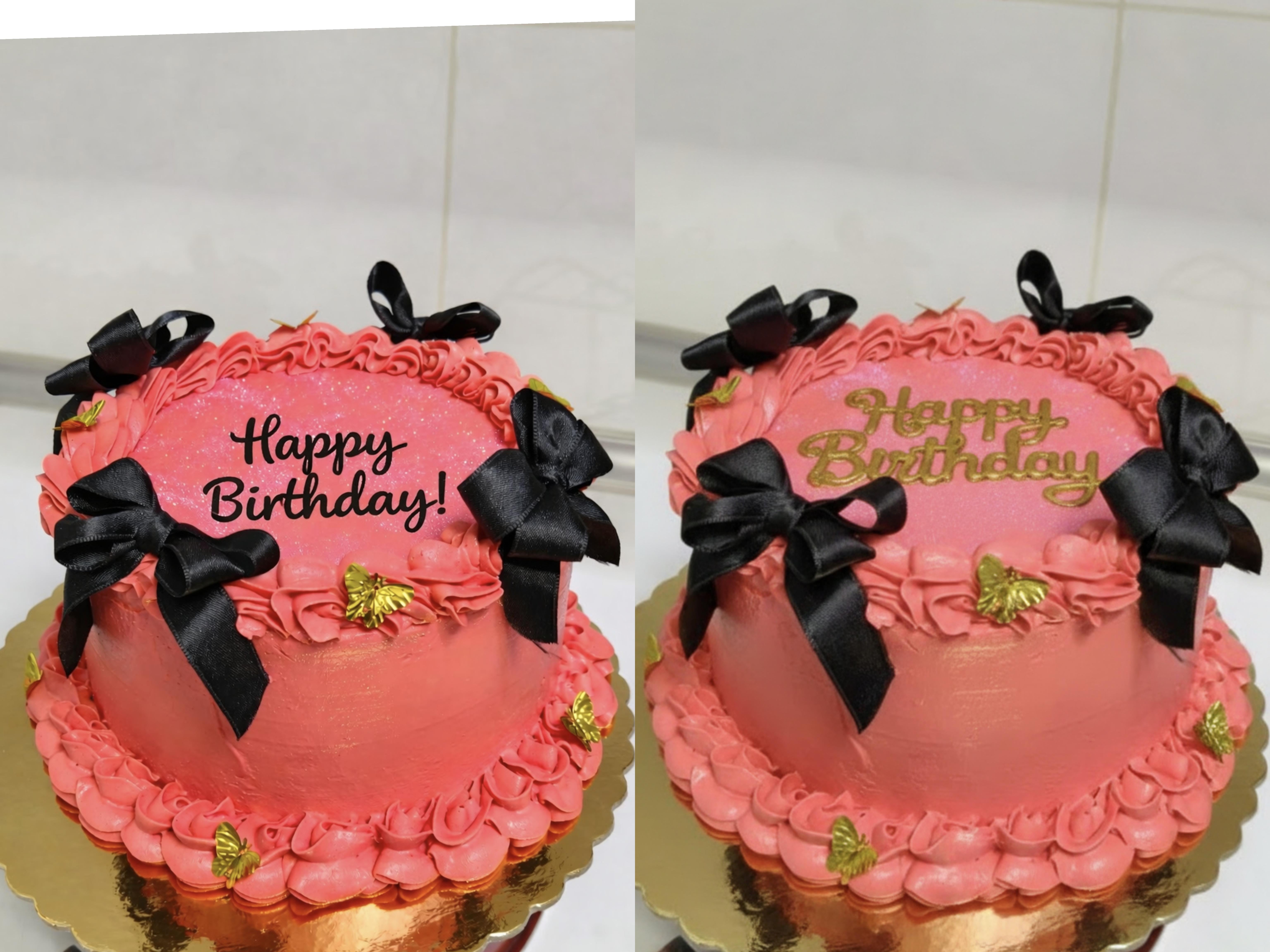
Please help me, what color should I use for writing between black and gold?
Please help me, what color should I use for writing between black and gold?
by Embarrassed_Idea1962
35 Comments
Exciting-Duty-8302
White?
Historical-Ad6916
Black pops more
SnooTangerines319
I like the gold, it doesn’t distract from the rest of the cake
Then_Double8677
Black. More cohesive.
SGSL
Why not both? Outline gold with black
feralK0ala
Black to stand out.
Gold to blend in.
If youre wanting it to pop then definitely the black, it drew me in right away. Especially eith the matching bows.
Eta, maybe some gold butterflies near the black too. Like one above on one side, one below on the other.
PikaJenna
Do black first then gold on top of it with a slightly smaller tip to give it an underlying shadow that pops out more
faith_plus_one
Black
malijaa
Gold feels more special
NewbieMaleStr8isBack
Black
kissylace
Black matches the colors of the ribbons and just looks right
Pretend_Goal_7311
For me its hard cuz its not just a color comparison. The writing style is diff. I love the black pop tho.
No_Oil_1256
I like the black, too.
CatMom4250
I think black would stand out more and would compliment the bows 😇🖤
Euphoric-Proposal-42
Black
guilty1here
Blackidy black blaaacckckk
tinykrytter
Black. Gold looks pretty as an accent! Black stands out more
Specialist_Pomelo_97
Black. Go for better contrast.
SongGardenWolf
Black
MotherEastern3051
Personally I would go gold and lose the ribbons. The cake looks amazing but the bows look odd and cheaper what otherwise looks like a professionally done classy cake.
MonsteraLeaf14
Black stands out more.
consuela_bananahammo
Can you do both? Gold and then smaller black on top so the black writing is “outlined” in the gold?
OneTangerine792
I think black
SchoolForSedition
Gold, and gold ribbons.
Appropriate_Box8098
Black.
ChiiChan87
The black pops more and matches the bows
Elizcan
Black
WhySoSeriousJoker247
Black pops more
InkandPage
Black for sure
saneeeeeeeeeek
I personally like the gold
fullyjustanidiot
Black and if you can, for the i with a butterfly
ConsequenceJust8977
I like the black….it stands out more. You could do a thin gold outline. Try it on parchment paper for practice to see what it looks like first before committing.
eerieminix
Double lettering with the base in black icing and the top in gold.


35 Comments
White?
Black pops more
I like the gold, it doesn’t distract from the rest of the cake
Black. More cohesive.
Why not both? Outline gold with black
Black to stand out.
Gold to blend in.
If youre wanting it to pop then definitely the black, it drew me in right away. Especially eith the matching bows.
Eta, maybe some gold butterflies near the black too. Like one above on one side, one below on the other.
Do black first then gold on top of it with a slightly smaller tip to give it an underlying shadow that pops out more
Black
Gold feels more special
Black
Black matches the colors of the ribbons and just looks right
For me its hard cuz its not just a color comparison. The writing style is diff. I love the black pop tho.
I like the black, too.
I think black would stand out more and would compliment the bows 😇🖤
Black
Blackidy black blaaacckckk
Black. Gold looks pretty as an accent! Black stands out more
Black. Go for better contrast.
Black
Personally I would go gold and lose the ribbons. The cake looks amazing but the bows look odd and cheaper what otherwise looks like a professionally done classy cake.
Black stands out more.
Can you do both? Gold and then smaller black on top so the black writing is “outlined” in the gold?
I think black
Gold, and gold ribbons.
Black.
The black pops more and matches the bows
Black
Black pops more
Black for sure
I personally like the gold
Black and if you can, for the i with a butterfly
I like the black….it stands out more. You could do a thin gold outline. Try it on parchment paper for practice to see what it looks like first before committing.
Double lettering with the base in black icing and the top in gold.
Black
Black