
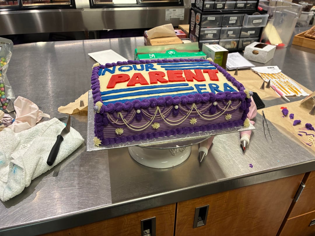
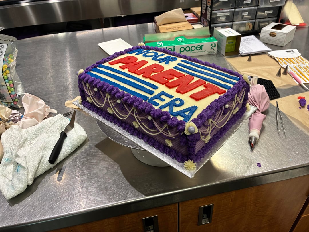
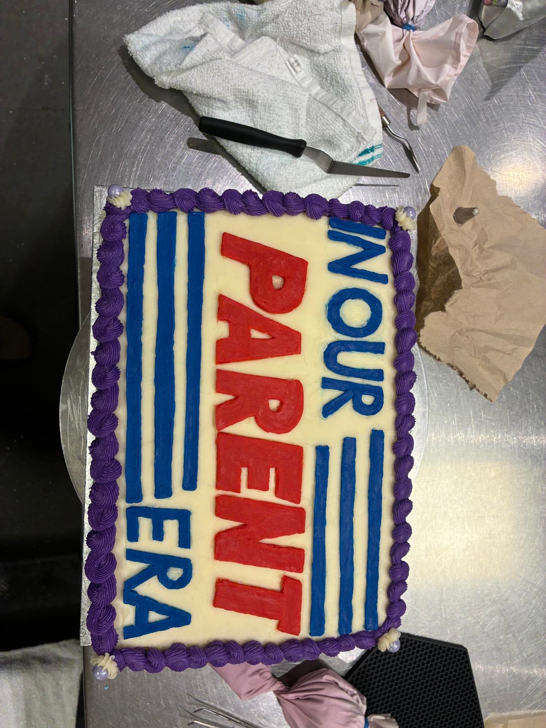

Customer’s request: a 1/4 sheet cake with this Costco logo reminiscent design on it saying “in our parent era”, and since the Costco logo is red and blue on a white background, they feared it would look too patriotic with just the red white blue decoration. They requested to also use shades of purple when decorating the cake since it was their baby’s color. (I assume it’s a baby shower cake)
This is what I came up with, i free hand drew the lettering using only toothpicks to measure. The cake was frosted in cream cheese frosting but my designs were done with American buttercream. I had a bit of trouble with the spacing and lettering in the top left corner but otherwise I think I did okay. All in all it took me about four hours.
What would you have done? Do you think the color scheme came out okay in my end result? Do you think the lettering looks okay?
by _alienchild_
18 Comments
this is iconic no notes
I like it. Needs to be a good first impression. Dont over think it.
Odd request but I’d say you nailed it.
I really like it but it just bothers me that the indentation of the lines next to the E is in the wrong direction
You absolutely killed it
I is too close to the wall and there should be a space between the N and O. That is bothering me soooo much. Looks like one word. I would have made the lines thicker too.
That being said. The rest looks good!
Wonderful
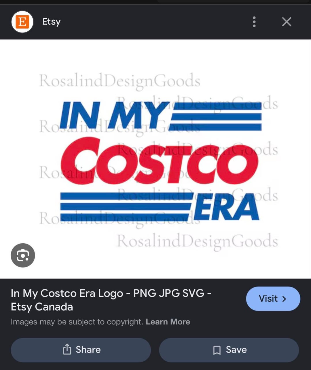
I have so many questions. Why did they want it to look like the Costco logo when the saying on the cake has nothing to do with Costco? Do they really like Costco?
I think it’s weird as hell but you gave them exactly what they wanted.
InOur definitely reads as one word and the purple is throwing me, it feels… random… with the red & blue. But I instantly recognized the Coscto inspo.
Looks like what they asked for.
I maybe would have just done the graphic smaller and centered in the square then a little more purple piping. That’s really it. I think you did really good recreating the picture! And also that piping work on the sides is absolutely beautiful.
They got what they ordered! A wi is a win is a win
Such an odd request for a cake. Honestly, who would care about something like this? Absolutely absurd in my opinion.
I love it, honestly, but the spacing of the letters made me read it as “Nour parent era.” r/kerning would like a word.
I’m struggling with the “inour” crowding with with extra white space to the right of “our”. Also the ‘P’ leans to the right more than the other letters in “Parent”. I like your templating goals but it sorta shows how the ‘O’ in your ‘our’ looks like it was forgotten and squeezed in. But all in all I bet the customers would be happy that this resembles what they asked for
This cake is unhinged and I love it.
The I isn’t legible and makes it look like the first word is nour. I wouldn’t accept that as is as a customer.
I think it looks great!
A future cheat is take a piece of wax paper and draw out your outline and grid for the lettering and then pipe it onto it and lightly add another piece over it. Put in freezer, pull the top piece off and lay it out on the cake. Much easier to control your spacing and scrape off mistakes to get it perfect!
Seriously though, your version is awesome and impressive for free handing it!
I am super impressed with your lettering op! I thought the red was fondant at first. My only suggestion would have been to bring more of the purple to the top or sprinkle some of the blue and red onto the sides so it looks more cohesive as a piece. Otherwise amazing work, your lines are beautiful and your swag drops on the side are so neat and even!