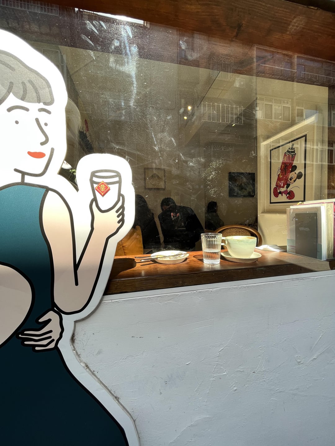
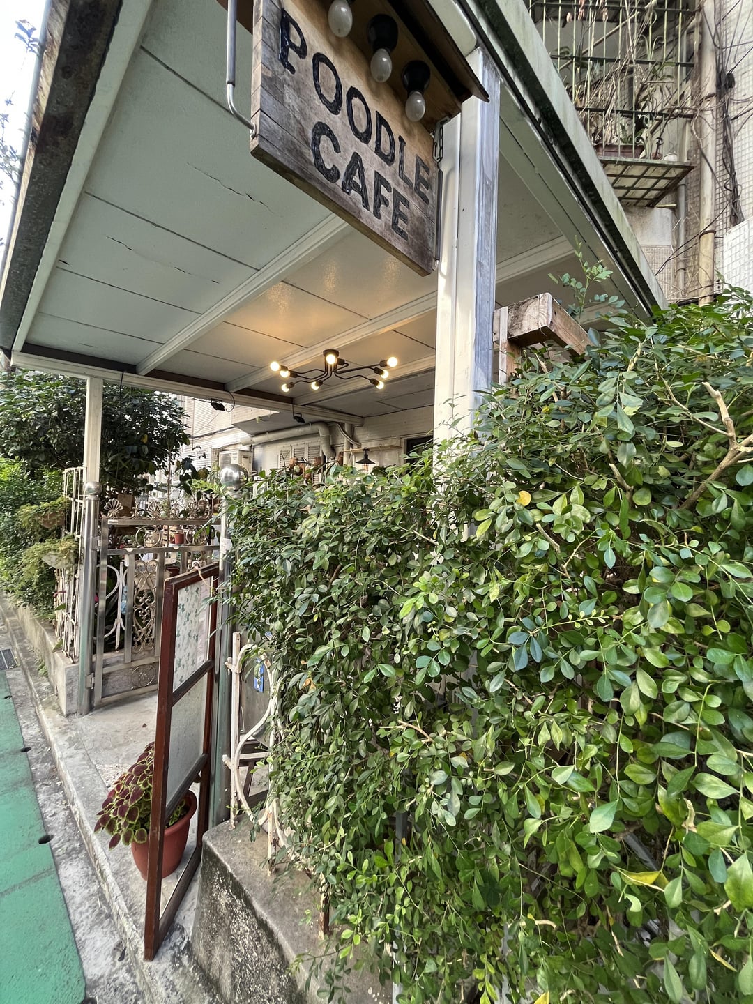
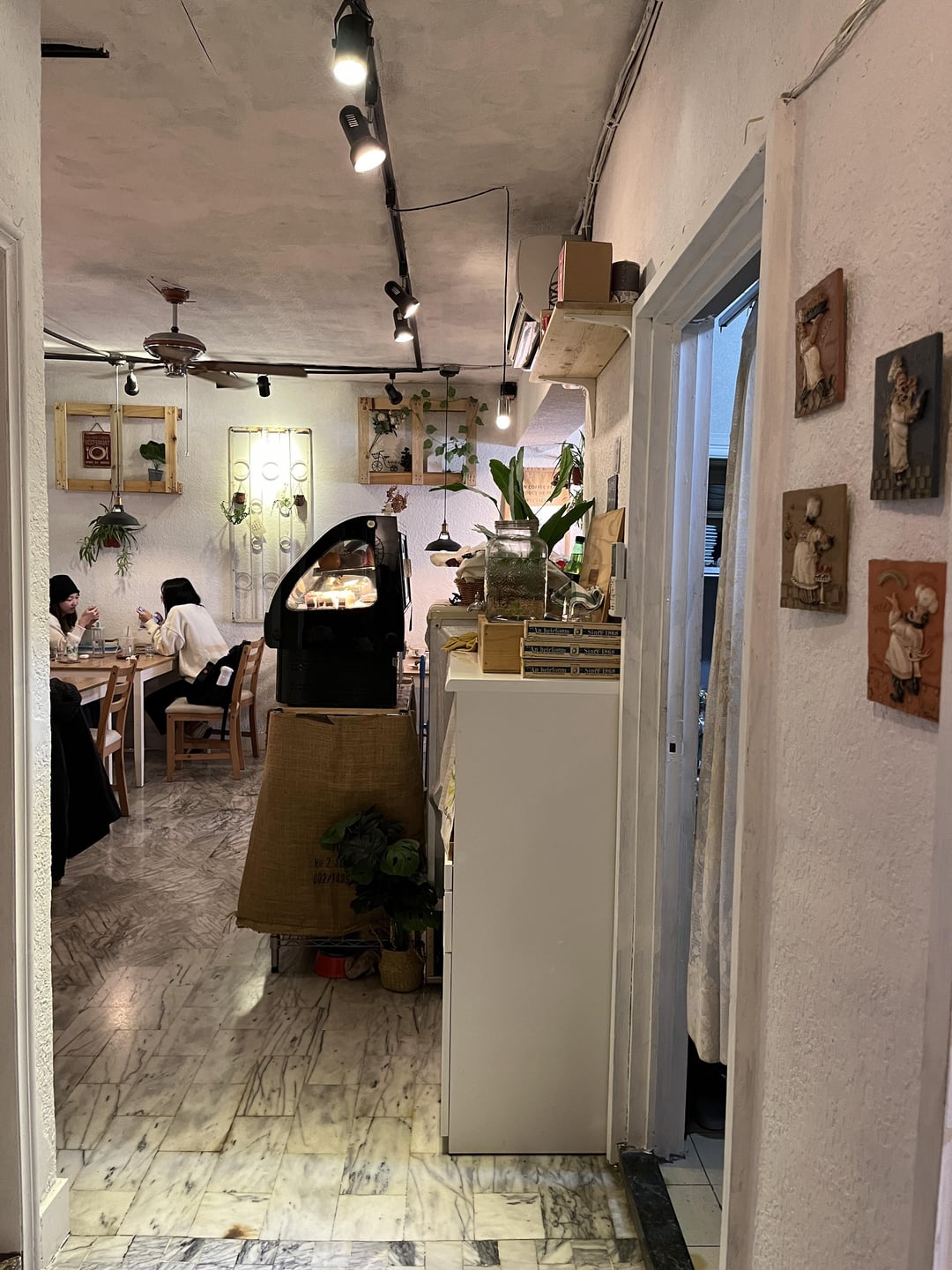
Besides coffee! Do you like the layout and decoration of the store?
Besides coffee! Do you like the layout and decoration of the store?
by arpolo2000
11 Comments
woodsvvitch
Perhaps some more inside plants and string lights would help it to look less like my grandma’s dining room. I think also the pictures you posted made it look really small and cramped so it is hard to say much about the layout besides that it looks exactly like my grandparents house and not a coffee shop lol. The outside looks like the entrance to a really eclectic coffee shop though.
vegetablemanners
I would definitely say it’s charming. Not my favorite style personally but I do appreciate it.
arpolo2000
The coffee master is the key to the arrangement
ISOLDASNAKE
Not a big fan personally, adding plants and a little bit of color will help
Oldfashionedatheart
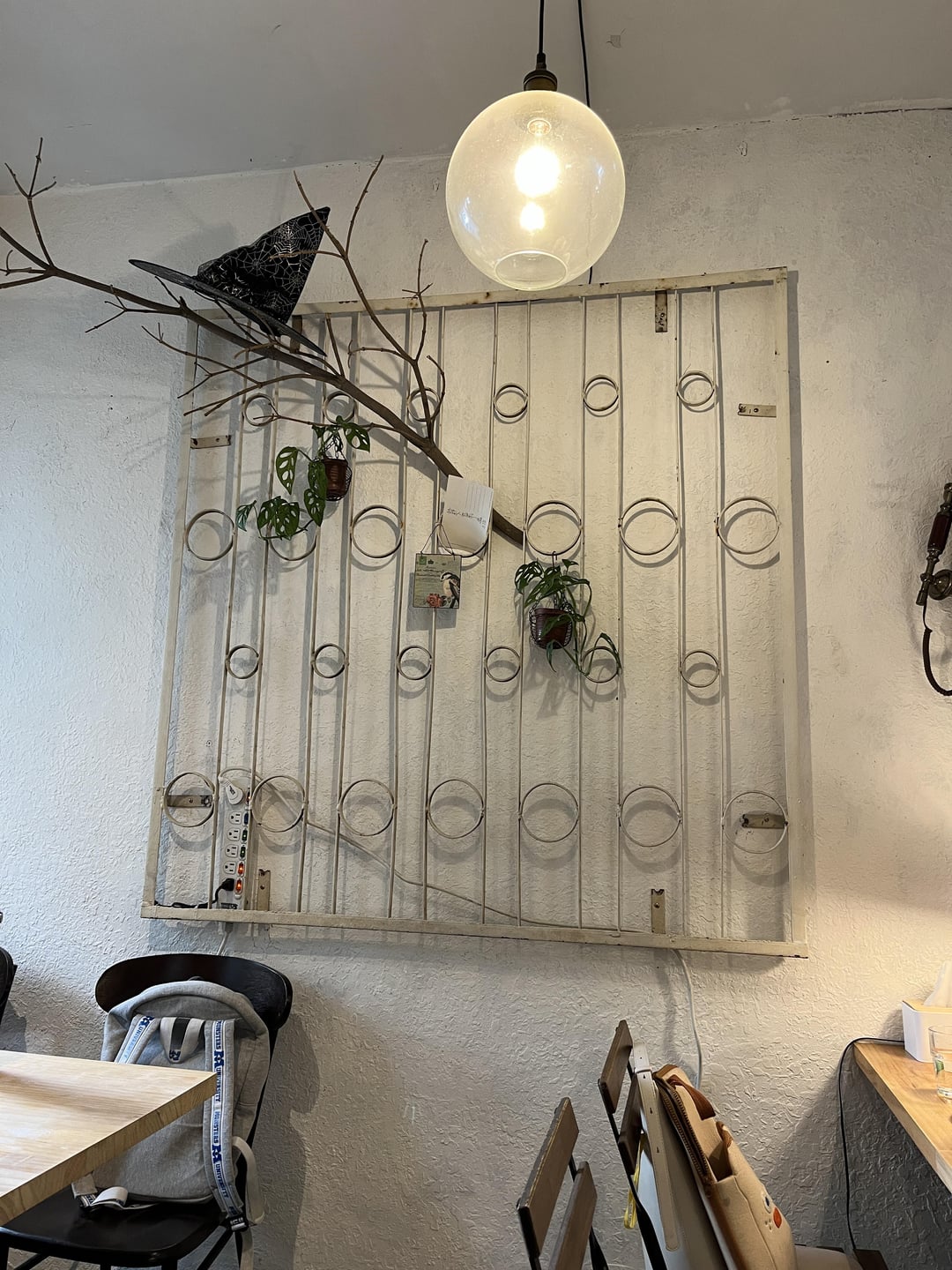
I don’t think that the spiderweb witch hat goes with any other decor. Probably best to take that down. I don’t really understand the theme other than “my grandparents house but bare”
beeranden
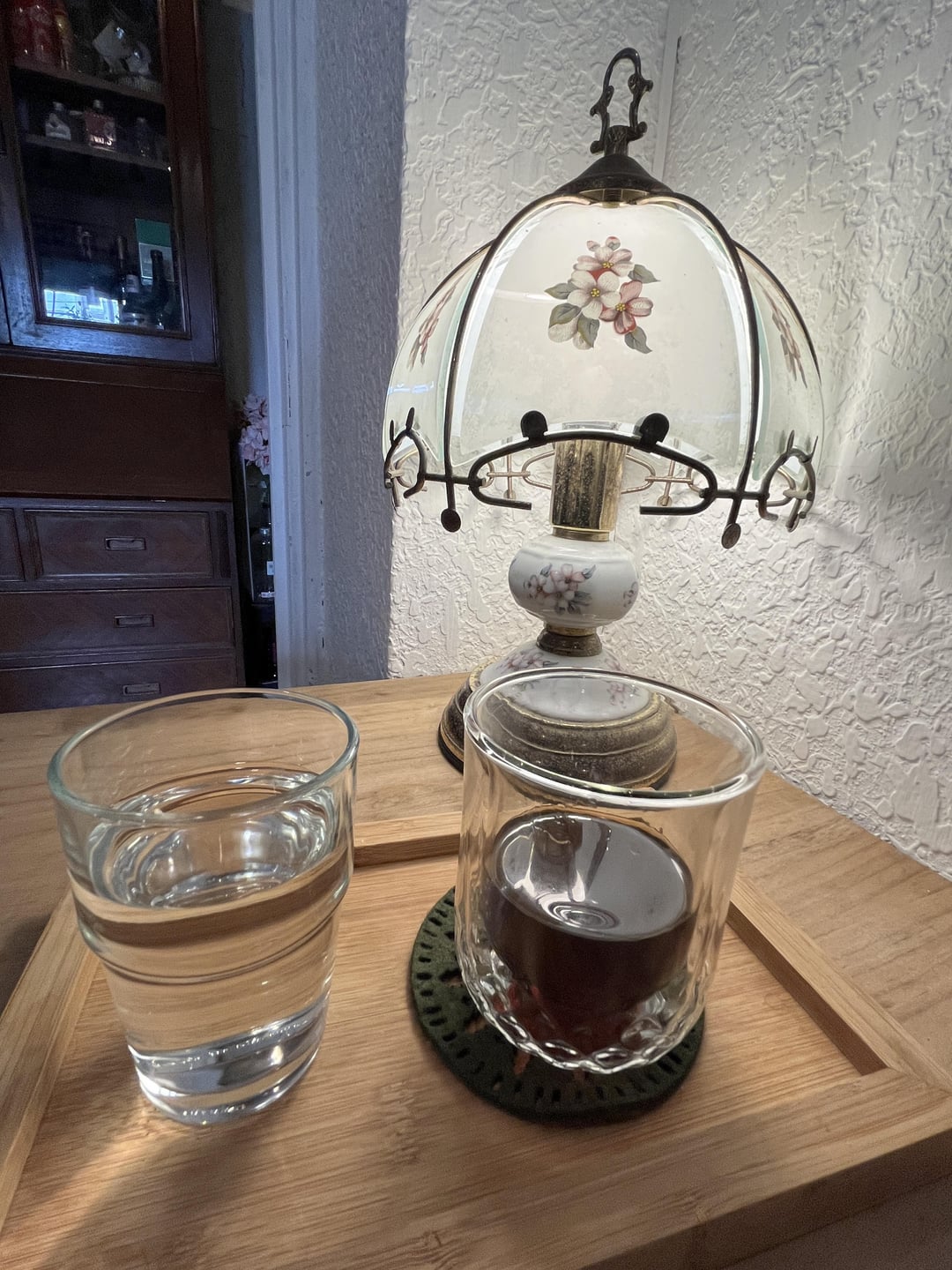
Needs cleaning and paint. I’m sure it’s more charming in person but to me it looks dusty/dirty which makes me question the sanitation practices in the prep area.
Manybalby
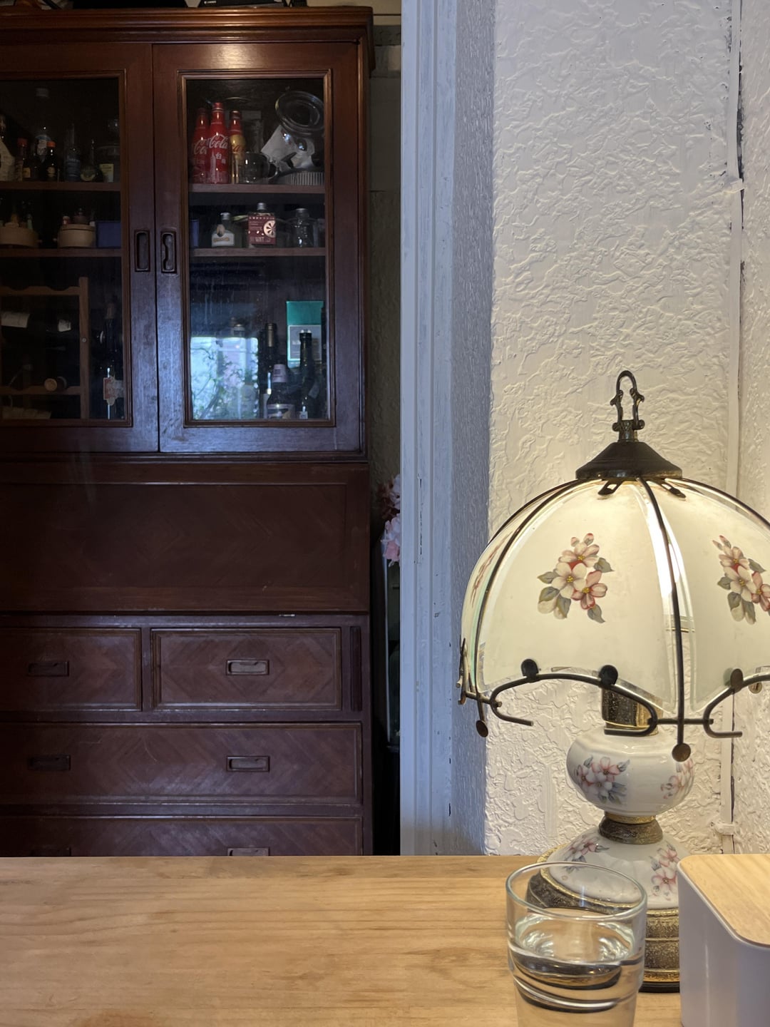
Not really, It gives me cluttered dining room/kitchen vibes.
SteveMoney88
Where is this located? Also not a big fan of the vibes
saoirsecaoilfhoinn
reminds me of grandma’s house
ExaminationFirm6379
no
afiqasyran86
White color paint with textures reminds me of 20 years ago trend of wall painting. Redo the painting with plain texture and look for “color of the year” in Jotun, Dulux, etc.
Remove that “italian chef” wall deco. Either put one abstract painting on one wall or nothing at all instead of generic wall deco.

11 Comments
Perhaps some more inside plants and string lights would help it to look less like my grandma’s dining room. I think also the pictures you posted made it look really small and cramped so it is hard to say much about the layout besides that it looks exactly like my grandparents house and not a coffee shop lol. The outside looks like the entrance to a really eclectic coffee shop though.
I would definitely say it’s charming. Not my favorite style personally but I do appreciate it.
The coffee master is the key to the arrangement
Not a big fan personally, adding plants and a little bit of color will help
I don’t think that the spiderweb witch hat goes with any other decor. Probably best to take that down. I don’t really understand the theme other than “my grandparents house but bare”
Needs cleaning and paint. I’m sure it’s more charming in person but to me it looks dusty/dirty which makes me question the sanitation practices in the prep area.
Not really, It gives me cluttered dining room/kitchen vibes.
Where is this located? Also not a big fan of the vibes
reminds me of grandma’s house
no
White color paint with textures reminds me of 20 years ago trend of wall painting. Redo the painting with plain texture and look for “color of the year” in Jotun, Dulux, etc.
Remove that “italian chef” wall deco. Either put one abstract painting on one wall or nothing at all instead of generic wall deco.