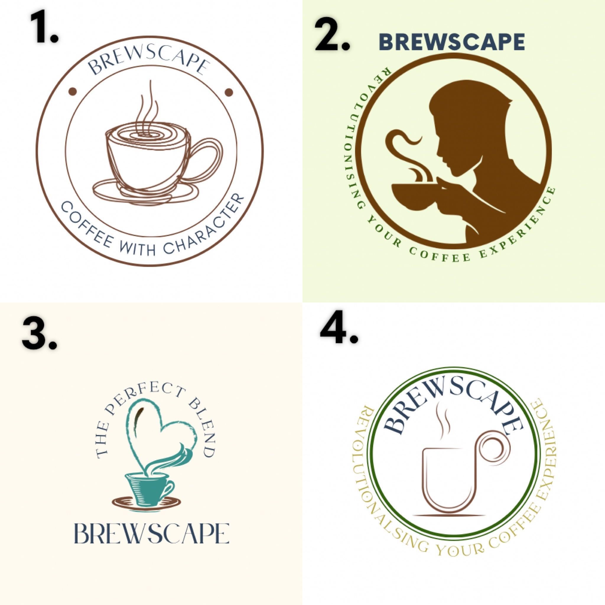
Which one speaks more ethical/superior taste/community pls? It’s for a college project!
Which one speaks more ethical/superior taste/community pls? It’s for a college project!
by SunShineFairyLocks
33 Comments
icecoldmacchiato
I’d use 3 but change it so it has the tagline from 1
ChefMaple
Number 3
RuleFancy
I don’t think either of these do. Number 3 is the best, imo, but it doesn’t really give off ethical/superior/community vibes. Kind of gives off coffee for animal charity vibes. It’s still the best out of the 4
ozymanhattan
1 is the best design.
iamsammovement
As I understand it, Old School Brew Scape is much more popular than Brew Scape. Micro transactions and lack of integrity will kill any business.
kate_lysen
2
simvike
1 and 3 are close but I’d go with 1
saveasseatgrass69420
I’d go with 1 or 3 because they both speak the most to the community aspect. I wouldn’t go to a coffee shop with logo #2, a coffee shop with that logo would be a little too pretentious for my liking.
celestialconfusion
I love the first one!
rdawes26
I like #1. Simple minimalistic marketing does better. The message is clear and the design is easier to identify.
I have a degree in international marketing, but I am far from the best to give advice.
pollyanna15
I’m surprised by the people who like 3. The heart seems kind of childish to me. Maybe if it was a globe instead? FYI The word revolutionising is missing an i in 4.
CloudsInMyCoffee32
Unfortunately, I don’t see any of the logos possessing any of these themes.
Slambo00
1 it’s the most concise and clean, and the tag fits the icon- line art w character of a cub coffee. But the brewscape lettering is not acceptable for the ethical part. I think a sturdier serif face would do that a lot better-
Caslon bold. Just for basic legibility and gravitas.
thisisnotreallifetho
1 is great!
hxgmmgxh
4
Jerrycurlzzzzzzz
1
ThrowDeepALWAYS
1
ankarmool
1
The-Hand-of-Midas
The word “brew” makes everything feel cheap. It’s like when someone asks for a “cup of Joe” I know they have no idea about coffee.
strider30040
i like coffee with character
nbbae
4
Vandalhart
Not sure if your still looking for feedback, but what about the design from 1 or 3 but with everything else framed like it’s a mug and the design is in the foam on the coffee?
sifinut
#4 looks best. Crisp and clean, easy to read. More up to date design. Would be better with a smaller verse like #1. I was a graphic designer and have since retired.
Richard_TM
For this fictional coffee shop, I don’t see any that display those characteristics, especially in the taglines. I’d use a tagline like “ethically sourced, locally roasted”
Aggressive_Ad_4032
2
THEE-ELEVEN
1, 3 & 4 are too wispy and busy. Waaay too much to see at a glance.
r7908
1
CriminyJickettsJinja
No. 1
ItchyButPleasant
4
LimitGroundbreaking2
Use the RuneScape logo 😂
onemanhumanpyramid
Please dont conflate ethics and taste?
Veloute1
Take1and delete coffee with character and add the perfect blend.
4camjammer
Ok. Brutally honest?
I don’t know anything about design or graphics. So… I just asked my wife. Why? Because she was a marketing/graphics director for a global 4 firm and now owns award winning coffee shops in Texas.
Her opinion: She doesn’t like any of them. But if she had to choose… #1 maybe #2.

33 Comments
I’d use 3 but change it so it has the tagline from 1
Number 3
I don’t think either of these do.
Number 3 is the best, imo, but it doesn’t really give off ethical/superior/community vibes. Kind of gives off coffee for animal charity vibes. It’s still the best out of the 4
1 is the best design.
As I understand it, Old School Brew Scape is much more popular than Brew Scape. Micro transactions and lack of integrity will kill any business.
2
1 and 3 are close but I’d go with 1
I’d go with 1 or 3 because they both speak the most to the community aspect. I wouldn’t go to a coffee shop with logo #2, a coffee shop with that logo would be a little too pretentious for my liking.
I love the first one!
I like #1. Simple minimalistic marketing does better. The message is clear and the design is easier to identify.
I have a degree in international marketing, but I am far from the best to give advice.
I’m surprised by the people who like 3. The heart seems kind of childish to me. Maybe if it was a globe instead? FYI The word revolutionising is missing an i in 4.
Unfortunately, I don’t see any of the logos possessing any of these themes.
1 it’s the most concise and clean, and the tag fits the icon- line art w character of a cub coffee. But the brewscape lettering is not acceptable for the ethical part. I think a sturdier serif face would do that a lot better-
Caslon bold. Just for basic legibility and gravitas.
1 is great!
4
1
1
1
The word “brew” makes everything feel cheap. It’s like when someone asks for a “cup of Joe” I know they have no idea about coffee.
i like coffee with character
4
Not sure if your still looking for feedback, but what about the design from 1 or 3 but with everything else framed like it’s a mug and the design is in the foam on the coffee?
#4 looks best. Crisp and clean, easy to read. More up to date design. Would be better with a smaller verse like #1.
I was a graphic designer and have since retired.
For this fictional coffee shop, I don’t see any that display those characteristics, especially in the taglines. I’d use a tagline like “ethically sourced, locally roasted”
2
1, 3 & 4 are too wispy and busy. Waaay too much to see at a glance.
1
No. 1
4
Use the RuneScape logo 😂
Please dont conflate ethics and taste?
Take1and delete coffee with character and add the perfect blend.
Ok. Brutally honest?
I don’t know anything about design or graphics. So… I just asked my wife. Why? Because she was a marketing/graphics director for a global 4 firm and now owns award winning coffee shops in Texas.
Her opinion: She doesn’t like any of them. But if she had to choose… #1 maybe #2.
Good luck.