Never drank this kind of wine before, but that the labels are fun and flashy. What other labels stand out? Cheating if you say Petrus or something.
by b1ackfyre
16 Comments
flitcroft
Rabble’s augmented reality wine labels are still the coolest I’ve seen. [https://tactic.studio/rabble-ar-app](https://tactic.studio/rabble-ar-app)
mercaptans
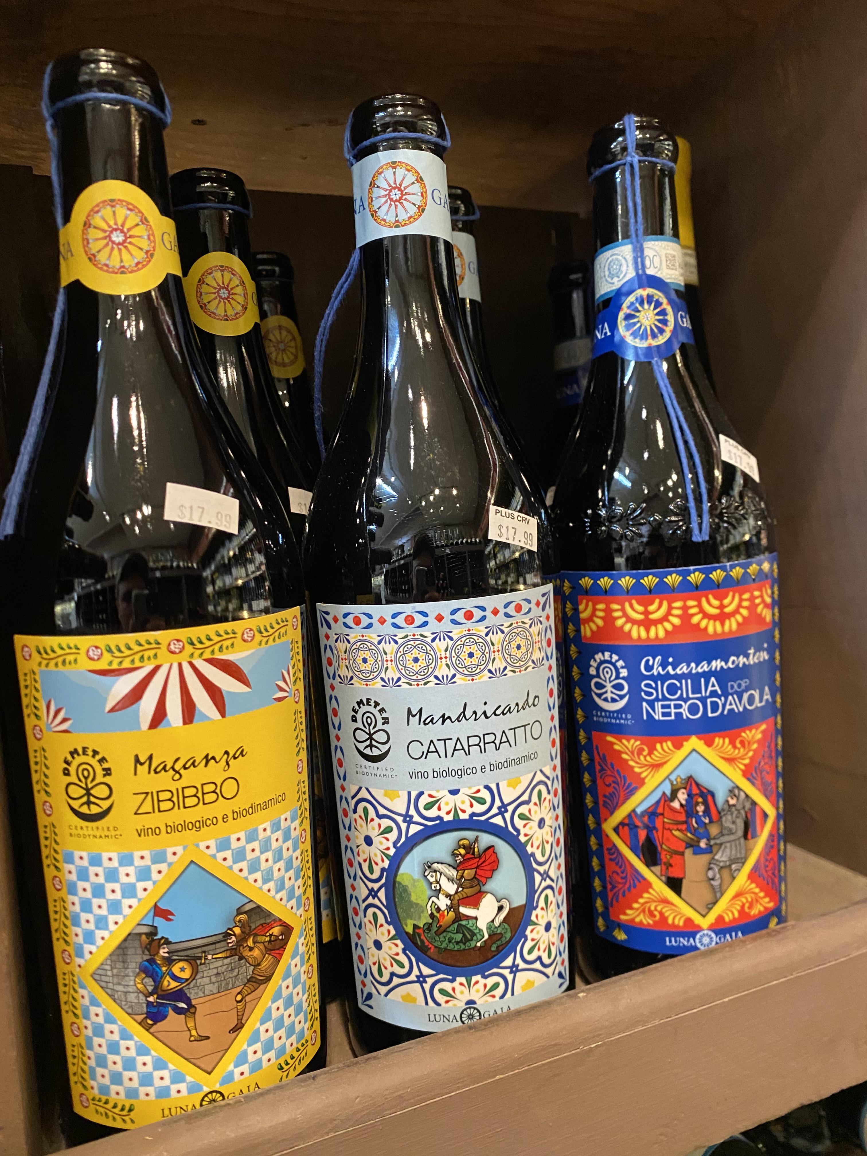
They all look like different chili sauce labels tbh
Pizzadontdie
I actually just tasted those and they were some of the worst wines I’ve ever had
Realistic-Ad-2612
Orin Swift
phantasmagorovich
I think my favorite labels are still Peter Wetzer‘s. They have a great balance of classic look with a twist.
But then even labels that I don’t like can feel iconic because of the wine. One that immediately comes to mind is Werlitsch. Everything about that label is horrible to me. It looks like low effort organic hand cream you can buy at a farmers market in a village in the middle of nowhere. Or rather anywhere, because it is so generic.
dimsum2121
Amuse Bouche does a label for their Vin Perdu line that is ‘holographic’. Very cool. Supposed to be proprietary technology iirc.
Either super mysterious/minimal and eye-catching (Sine Qua Non, William Downie, Turtle Rock, Prieure Roch) or super Gothic vampire shit (Hudelot-Noellat, Fourrier, Rousseau, Raen)
simon_kroon
I think alheit vineyards has amazing labels. And more importantly the wine is amazing too.
I’d actually prefer to see a combination of traditional, old-world labels (that reliably state the varietal, region, and year) **and** a trend I’ve seen mostly in American labels to present an artistic illustration that goes well beyond traditional, ornamental text and an ornate seal.
Call me a sucker for marketing, but sometimes those graphic illustrations are compelling and with talented design, they match the style well. However, I’m tired of having to turn to the back of the bottle to figure out what’s actually in it.
Although it may not be a perfect example, Opus One combines the two approaches to the front label.
Responsible-Read2247
Sine Qua Non
shedrinkscoffee
I’ve seen these bottles around at whole foods in the US. I never bought them. TBH I don’t see many people buying wine at WF in general
Libertine1187
I just can’t not like Claus Preisingers ‘Puszta Libre’. I love the bottle shape and the little winking face on the cork, too.
I think it perfectly encapsulates what’s inside the bottle – a light, crunchy, fruity, slightly fizzy, Austrian red. It’s bloody delicious and my wife has made several bottles into candle holders for the balcony.


16 Comments
Rabble’s augmented reality wine labels are still the coolest I’ve seen. [https://tactic.studio/rabble-ar-app](https://tactic.studio/rabble-ar-app)
They all look like different chili sauce labels tbh
I actually just tasted those and they were some of the worst wines I’ve ever had
Orin Swift
I think my favorite labels are still Peter Wetzer‘s. They have a great balance of classic look with a twist.
But then even labels that I don’t like can feel iconic because of the wine. One that immediately comes to mind is Werlitsch. Everything about that label is horrible to me. It looks like low effort organic hand cream you can buy at a farmers market in a village in the middle of nowhere. Or rather anywhere, because it is so generic.
Amuse Bouche does a label for their Vin Perdu line that is ‘holographic’. Very cool. Supposed to be proprietary technology iirc.
https://www.amusebouchewine.com/vin-perdu/index.php
Edit. It is their patented label design
> patented flip lenticular label
Either super mysterious/minimal and eye-catching (Sine Qua Non, William Downie, Turtle Rock, Prieure Roch) or super Gothic vampire shit (Hudelot-Noellat, Fourrier, Rousseau, Raen)
I think alheit vineyards has amazing labels. And more importantly the wine is amazing too.
[Unico Zelo](https://www.unicozelo.com.au/collections/vinous-awesomeness) has some cool labels, and names too.
defenitely none of the above ^^
I’d actually prefer to see a combination of traditional, old-world labels (that reliably state the varietal, region, and year) **and** a trend I’ve seen mostly in American labels to present an artistic illustration that goes well beyond traditional, ornamental text and an ornate seal.
Call me a sucker for marketing, but sometimes those graphic illustrations are compelling and with talented design, they match the style well. However, I’m tired of having to turn to the back of the bottle to figure out what’s actually in it.
Although it may not be a perfect example, Opus One combines the two approaches to the front label.
Sine Qua Non
I’ve seen these bottles around at whole foods in the US. I never bought them. TBH I don’t see many people buying wine at WF in general
I just can’t not like Claus Preisingers ‘Puszta Libre’. I love the bottle shape and the little winking face on the cork, too.
I think it perfectly encapsulates what’s inside the bottle – a light, crunchy, fruity, slightly fizzy, Austrian red. It’s bloody delicious and my wife has made several bottles into candle holders for the balcony.
Edit – [pic](https://www.google.com/search?client=ms-android-samsung-gs-rev1&sca_esv=c3100514c60d20a4&sca_upv=1&sxsrf=ACQVn0-pCJQxCxTqPeLtUGV5KxlPLA5oeQ:1713250195360&q=puszta+libre&uds=AMwkrPv52B5S2hmSWN_CfrSIIobQ0J6SkHGNpM0f9uIQP1v5lh5Q1MHLwUNK54343re22MUQzxqPmELwdmMb98cBhm1zygkQepvINzb2U_NlX7DQourrNX0ixa0a3qe6vzzBPUkTx-yS4vmXY-eklXtN4DyhFiQqYH8EFxgc2x68wZs4YffxweqaRsX5qjQGA3PiiOPBSf8eEpAoxvllngpYoOKgmkWZkxIY1o0ffEqLjfg0LY5C77D7XCzGd8vPhDqnfy6H8t0yvtve4H7nms8j8Si-WRiyF_8REbuqqFJFufFG6GGrXL8&udm=2&prmd=sivnmbtz&sa=X&ved=2ahUKEwjY47iqksaFAxWPiK8BHb5WCTYQtKgLegQIEhAB&biw=360&bih=667&dpr=3#vhid=2mxYblh96Kcz2M&vssid=mosaic)
I live in Sicily and I would never buy a wine with a label like that. It’s tourist trap merch.
Donnafugata