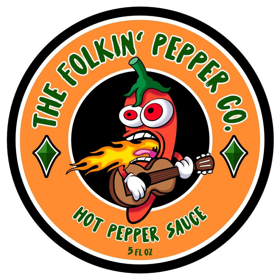
Can I get an honest opinion about a logo I made for my sauce?
Just a logo I created for when I gift hot sauces to my friends. What do you guys think?
by toge420
24 Comments
This_Week_On_SHADs
Awesome. Name sauces after famous folk or classic guitar songs. Spicy Caroline, Take me home (I’m dying of spicy pepper death on this) country road, Burnin’ home Alabama, Have you ever seen the milk, Ring of superhot fire,
thetylermarshall
I think it looks pretty good. It does seem fairly similar to most other hot sauce logos, lots of circles, colors (not much you can do there, tho). Some of the details may not show up as well in some assets (tongue and small details like guitar strings).
Bring_Your_Own_B
Rad!
sha1shroom
Dope!
Snowis_good
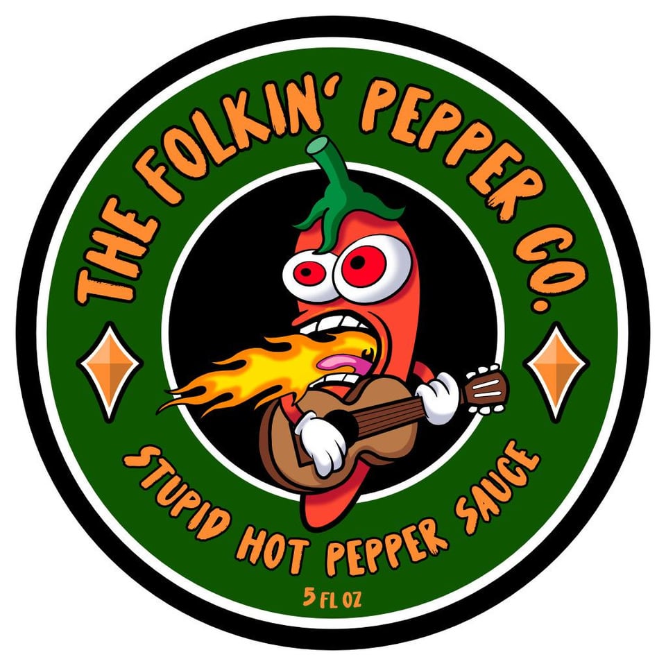
I like 1 over 2
albitross
Maybe give the stupid hot an electric 🎸to relay how amped up it is.
driftwood7386
Not original enough
VampMasta
IMO the bottom of the pepper should be layered under the circles. Will give it the same effect as the MGM lion where it seems to be popping out of the circle instead of just overlayed on it.
1Negative_Person
If this is just for gifts, I’d say it’s cute.
If you’re doing an actual business, then it’s generic and is going to sink into a background of a thousand other small brands with logos that look exactly like it.
ETA: the calyx is wrong on the pepper too. They don’t look like that.
gnomefront
Awesome label if you’re giving it out to friends. Won’t stand out from others on a retail shelf.
TrauMedic
Should be called:
Folkin’ Hot Pepper Co
form_jake
looks like clip art
Ellig0929
Thumbs up. Looks great.
echtemendel
It’s really nice, and tbh I like the second one (green bg) better. Hope you have it in vector format…
SoftwareSource
only note is i would switch the color schemes for the hot and stupid hot, other then that it’s pretty great.
VlDRlS
Quality wise i’d say pretty good. Just not my personal aesthetic taste
Zestyclose-Wafer2503
I like it! I would deliberately contrast the label against whatever colour sauce is in the bottles too, so the green one for orange/red sauces and vice versa!
Really cool touch to add to gifts, great idea!
Odd-Anteater-6183
I love it! The eyeballs are screaming!
lepisosteusosseus
I like it. I assume folkin’ is a play on fuckin’, so I’d suggest adding another word before or after it to emphasize that. Like The [synonym of hot] Folkin’ Pepper Co or Folkin’ Hell Pepper Co or something. Either lose the tongue or make it a lot bigger and have it below the flames. The eyes are kind of emotionless/flat. Maybe they could be crazier/more alarmed. And/or could use another color in addition to or instead of red around the pupils. To my eye the apostrophe is backwards and upside down—I would rotate it 180 degrees. The diamond things could be peppers or something music related.
86peppers
Love it! Partial to the orange.
toolsavvy
I like it
BastionofIPOs
Cool art. Cool name. Zero references to my asshole. 10/10

24 Comments
Awesome. Name sauces after famous folk or classic guitar songs. Spicy Caroline, Take me home (I’m dying of spicy pepper death on this) country road, Burnin’ home Alabama, Have you ever seen the milk, Ring of superhot fire,
I think it looks pretty good. It does seem fairly similar to most other hot sauce logos, lots of circles, colors (not much you can do there, tho). Some of the details may not show up as well in some assets (tongue and small details like guitar strings).
Rad!
Dope!
I like 1 over 2
Maybe give the stupid hot an electric 🎸to relay how amped up it is.
Not original enough
IMO the bottom of the pepper should be layered under the circles. Will give it the same effect as the MGM lion where it seems to be popping out of the circle instead of just overlayed on it.
If this is just for gifts, I’d say it’s cute.
If you’re doing an actual business, then it’s generic and is going to sink into a background of a thousand other small brands with logos that look exactly like it.
ETA: the calyx is wrong on the pepper too. They don’t look like that.
Awesome label if you’re giving it out to friends. Won’t stand out from others on a retail shelf.
Should be called:
Folkin’ Hot Pepper Co
looks like clip art
Thumbs up. Looks great.
It’s really nice, and tbh I like the second one (green bg) better. Hope you have it in vector format…
only note is i would switch the color schemes for the hot and stupid hot, other then that it’s pretty great.
Quality wise i’d say pretty good.
Just not my personal aesthetic taste
I like it! I would deliberately contrast the label against whatever colour sauce is in the bottles too, so the green one for orange/red sauces and vice versa!
Really cool touch to add to gifts, great idea!
I love it! The eyeballs are screaming!
I like it. I assume folkin’ is a play on fuckin’, so I’d suggest adding another word before or after it to emphasize that. Like The [synonym of hot] Folkin’ Pepper Co or Folkin’ Hell Pepper Co or something. Either lose the tongue or make it a lot bigger and have it below the flames. The eyes are kind of emotionless/flat. Maybe they could be crazier/more alarmed. And/or could use another color in addition to or instead of red around the pupils. To my eye the apostrophe is backwards and upside down—I would rotate it 180 degrees. The diamond things could be peppers or something music related.
Love it! Partial to the orange.
I like it
Cool art. Cool name. Zero references to my asshole. 10/10
I like green much better
I like it! 👍🏻