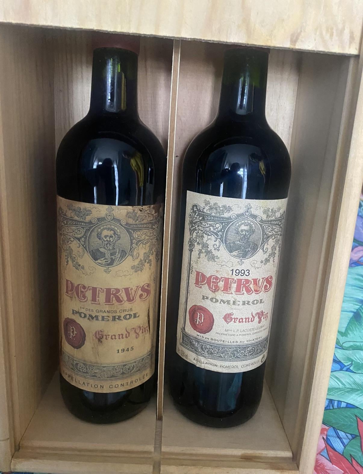
that ’45 label looks too pristine to be real, edges/corners look off to me. dunno.
also fill level on the ’45 is like to the top….you’d think it would be lower by now
cunningfolk322
No one does it like Rudy
dekeukenprins
The fill level on that ‘45 is really high. You would expect it to be lower. So I would say fake.
BroodjeHaring
Fake as hell. Though I’d like a closeup of the word Petrus.
SpaceJackRabbit
Take more pictures and send them to Pétrus. They’re the only ones who will have a definitive answer.
bone1205
You should just assume all Petrus from the 40’s is fake unless you have iron clad provenance.
CountofAnjou
The vintage font on the ‘83 looks really shonky
bteasye
The font for 1993 seems off and as mentioned the fill height on the 45 is high. Definitely need more photos of both and also information on provenance.
Business-Commercial4
Middle aisle of Lidl just crushing it these days
jacob62497
That’s a Chateau Rudy
Ralphlovespolo
Where did you buy this
samwise141
How tf could you prove provenance for a bottle that old? Id be so curious to try it…
ratamack
Fake af
Just-Sign-5394
It looks very fake.
Appropriate-Neat-771
Love the Albanians in the reflection, definitely fake.
ultralayzer
If you have to ask.
phdeeznutts
Fake
jcbsrl
Looks fake.
The older vintages of Petrus has a much ”clearer” green bottle. It’s not a dark tint and much more see through. But might be just the light in the picture.
Also is the top waxed? I don’t think Petrus ever waxed their corks but I could be wrong.
With all of that said, there is probably more 1945 fakes than real ones.
hello_world_1984
The 45 looks fake to me, fill is too high for a 80 year old wine and the label paper doesnt actually look age worn but rather just made to look dirty and old.
Spaceginja
Does anybody on this thread, and I have no problem with your own choices, actually spend more than $10,000 for a bottle of wine? Heck, I’ll lower it to $1,000. Pomerol’s seem like something only an emperor could afford.

20 Comments
that ’45 label looks too pristine to be real, edges/corners look off to me. dunno.
also fill level on the ’45 is like to the top….you’d think it would be lower by now
No one does it like Rudy
The fill level on that ‘45 is really high. You would expect it to be lower. So I would say fake.
Fake as hell. Though I’d like a closeup of the word Petrus.
Take more pictures and send them to Pétrus. They’re the only ones who will have a definitive answer.
You should just assume all Petrus from the 40’s is fake unless you have iron clad provenance.
The vintage font on the ‘83 looks really shonky
The font for 1993 seems off and as mentioned the fill height on the 45 is high. Definitely need more photos of both and also information on provenance.
Middle aisle of Lidl just crushing it these days
That’s a Chateau Rudy
Where did you buy this
How tf could you prove provenance for a bottle that old? Id be so curious to try it…
Fake af
It looks very fake.
Love the Albanians in the reflection, definitely fake.
If you have to ask.
Fake
Looks fake.
The older vintages of Petrus has a much ”clearer” green bottle. It’s not a dark tint and much more see through. But might be just the light in the picture.
Also is the top waxed? I don’t think Petrus ever waxed their corks but I could be wrong.
With all of that said, there is probably more 1945 fakes than real ones.
The 45 looks fake to me, fill is too high for a 80 year old wine and the label paper doesnt actually look age worn but rather just made to look dirty and old.
Does anybody on this thread, and I have no problem with your own choices, actually spend more than $10,000 for a bottle of wine? Heck, I’ll lower it to $1,000. Pomerol’s seem like something only an emperor could afford.