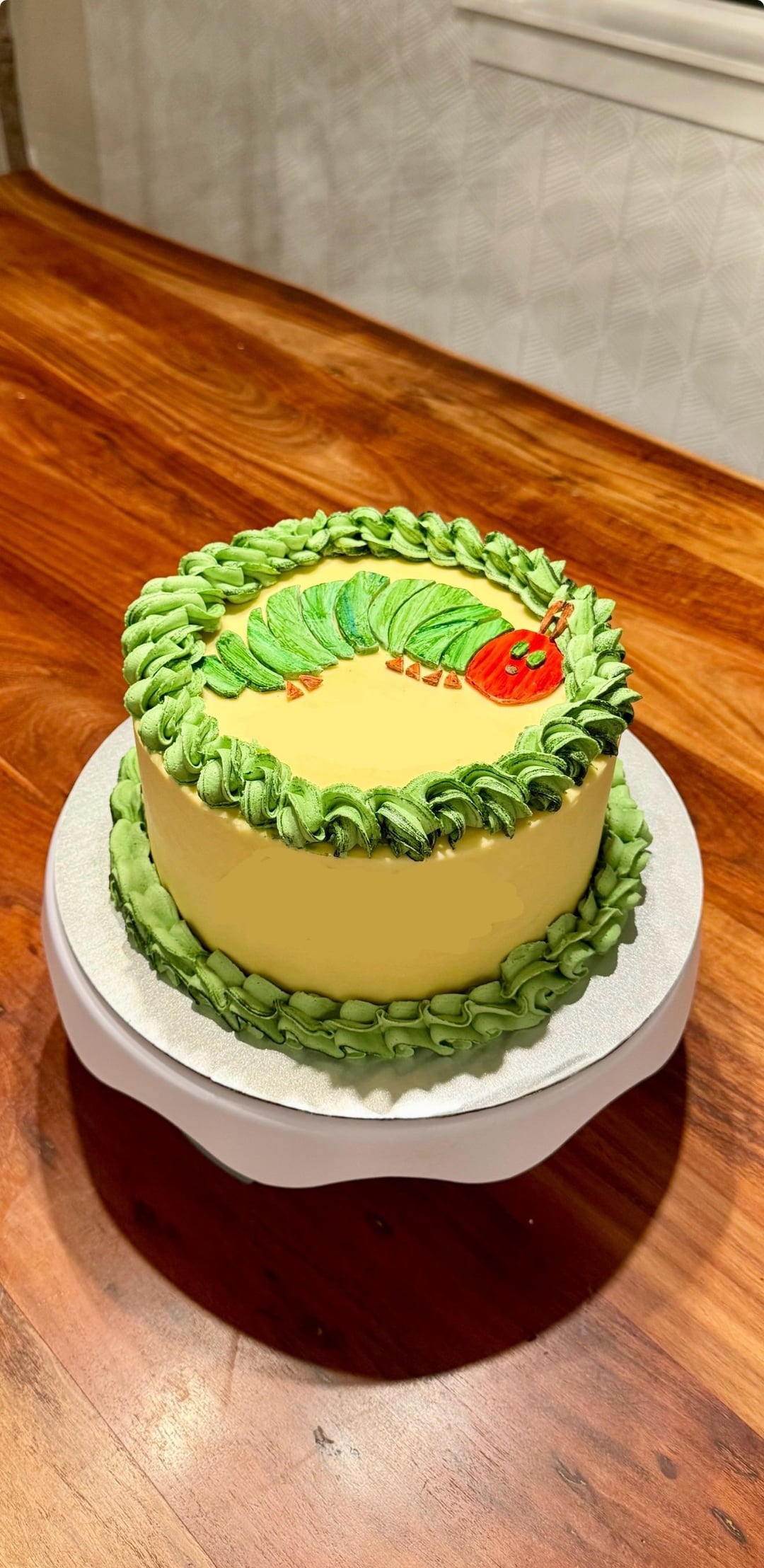
I know what I feel looks bad, but I’m curious what other people see.
by helluvapotato
8 Comments
groovydoll
I would just add some red accents to the middle part of the cake but overall it’s awesome
AeonBloodMoon
Def needs some color and variety of texture or forms. Maybe you could do different style tips for the borders. And then maybe do some fruits or foliage (in the same story book style) going around the center of the cake? But I really love the bits of black or dark green that’s in your borders already. Super creative and it reads very well. Just seems a little plain imo
jillianashleyb
Your border piping is really charming. If you want the edges a bit more defined, you could chill the cake first so the shapes hold their angles a little tighter, but the design already reads well.
Sensitive-Tune-7962
You’re way too hard on yourself, the cake looks fantastic!
Peppercorn_645
This is pretty incredible. Some sprinkles or rosette piping in an alternate color on the green piping on the top could add a pop of something but it’s not needed.
Edited to add, you could also add a second layer of border piping with smaller size tips (or 2) in alternating colors to add something!
okoatmeal
my opinion is that it’s perfectly presented and effective. it’s neat, has style, effective as a birthday cake, and looks compete and professional.
something I would ask you is, how is this final result different than how you pictured it being?
it’s kind of a subjective question, how to improve this. because to someone this is the perfect cake and exactly what they want.
as some people have mentioned, they would prefer slightly different details, some red sprinkles etc. some people would want it to be more cartoonish, or have brighter colors, or less precise edges, or taller, etc.
it’s really all about the end result you’re going for. like there are techniques and styles we can practice and master, or there could be a style and signature look we try to cultivate.
the way to improve is to keep trying new things and master different techniques, styles, and design aesthetics. as far as I can see, you’re a major talent and you can and should try as many techniques as you can to see how far you can go 👍
NewbieMaleStr8isBack
Looking good
scratsquirrel
This is adorable. I’d beat the frosting a bit more before using to get rid of some of those bubbles (noticeable in the green).
I’d also do a couple of extra smoothing rounds on the yellow for the side of the cake so it has a cleaner finish to it (I can see some patchiness when really focusing on it but wouldn’t have seen it had you not asked for areas to work on).
I’d bring some more of that red into the design, perhaps little lady bugs or other characters from the book into the sides of the cake too.
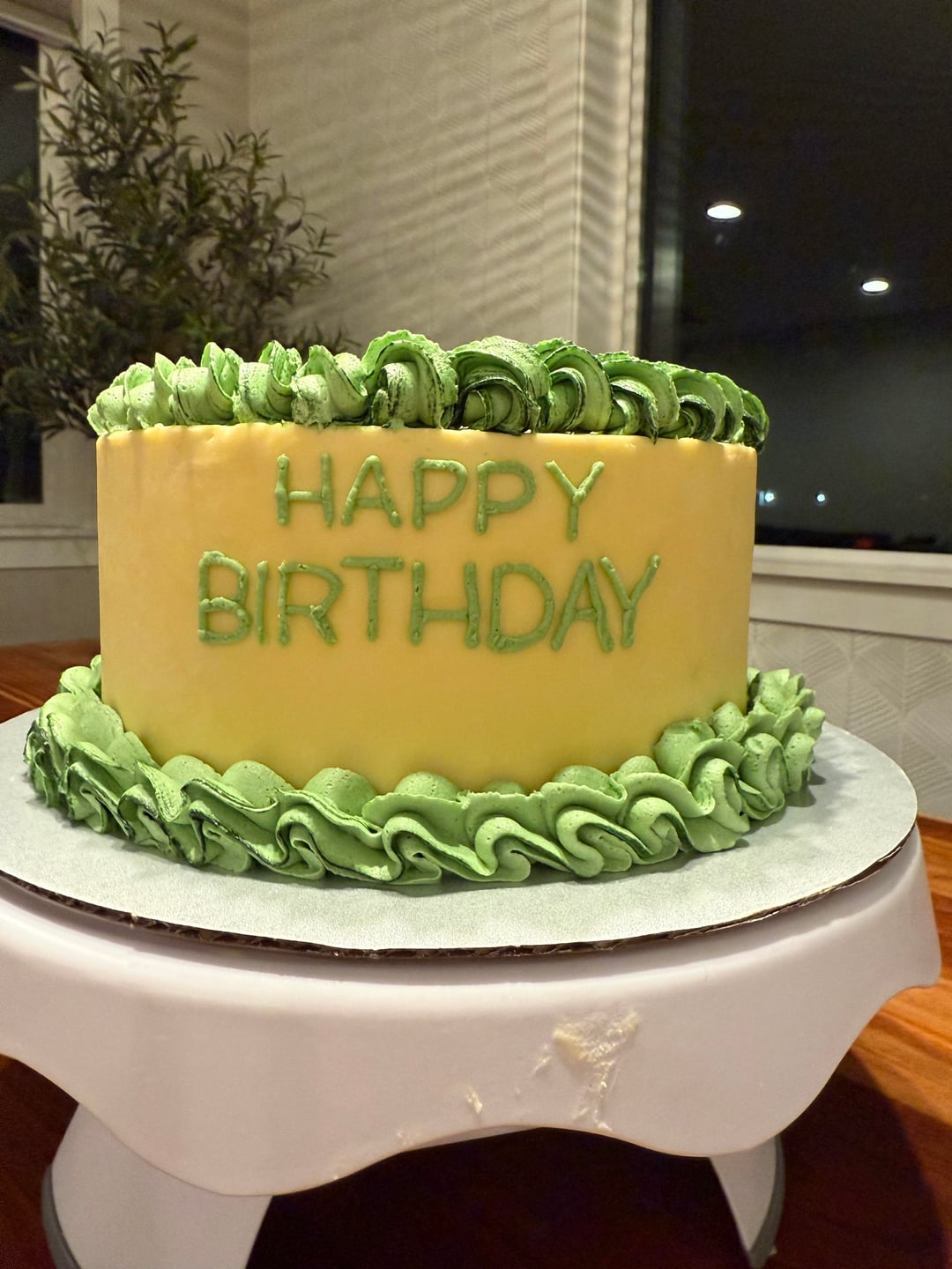
This is incredibly nit picky especially because you’ve done a far better job on the lettering than I ever would but there’s some unevenness in a couple of the letters but it’s very slight.

8 Comments
I would just add some red accents to the middle part of the cake but overall it’s awesome
Def needs some color and variety of texture or forms. Maybe you could do different style tips for the borders. And then maybe do some fruits or foliage (in the same story book style) going around the center of the cake? But I really love the bits of black or dark green that’s in your borders already. Super creative and it reads very well. Just seems a little plain imo
Your border piping is really charming. If you want the edges a bit more defined, you could chill the cake first so the shapes hold their angles a little tighter, but the design already reads well.
You’re way too hard on yourself, the cake looks fantastic!
This is pretty incredible. Some sprinkles or rosette piping in an alternate color on the green piping on the top could add a pop of something but it’s not needed.
Edited to add, you could also add a second layer of border piping with smaller size tips (or 2) in alternating colors to add something!
my opinion is that it’s perfectly presented and effective. it’s neat, has style, effective as a birthday cake, and looks compete and professional.
something I would ask you is, how is this final result different than how you pictured it being?
it’s kind of a subjective question, how to improve this. because to someone this is the perfect cake and exactly what they want.
as some people have mentioned, they would prefer slightly different details, some red sprinkles etc. some people would want it to be more cartoonish, or have brighter colors, or less precise edges, or taller, etc.
it’s really all about the end result you’re going for. like there are techniques and styles we can practice and master, or there could be a style and signature look we try to cultivate.
the way to improve is to keep trying new things and master different techniques, styles, and design aesthetics. as far as I can see, you’re a major talent and you can and should try as many techniques as you can to see how far you can go 👍
Looking good
This is adorable. I’d beat the frosting a bit more before using to get rid of some of those bubbles (noticeable in the green).
I’d also do a couple of extra smoothing rounds on the yellow for the side of the cake so it has a cleaner finish to it (I can see some patchiness when really focusing on it but wouldn’t have seen it had you not asked for areas to work on).
I’d bring some more of that red into the design, perhaps little lady bugs or other characters from the book into the sides of the cake too.
This is incredibly nit picky especially because you’ve done a far better job on the lettering than I ever would but there’s some unevenness in a couple of the letters but it’s very slight.