
As a guy I’ve always struggled to make “pretty cakes” I always like the more artistic, bloody, messy, and thematic ones. But I’ve been trying to get better with flowers and more soft feminine approach. I’d appreciate feedback on how to keep getting better. The only thing that gets me through it is my favorite part… the lettering 🤧 but also posting just to see who likes what and maybe that’ll help me as far as designing in the future. To me they feel basic, dull and boring…
by AeonBloodMoon
19 Comments
What? These are gorgeous. No notes. Your lettering is phenomenal. I mean if you want you can learn to pipe more flowers or try some stuff with a palette knife.
As a long time decorator, I don’t really think you need to be “better” – you’ve got incredible piping and design skills! But if you want a challenge, maybe try some larger format flowers like peonies etc? Look into Korean meringue buttercream recipes for a really gorgeous glossy look and check out some of the korean buttercream flowers that people make! I think that would scratch your itch when it comes to upping your game on “pretty”.
The only thing you could do better is offer a class to teach me your lettering!! These are beautiful!
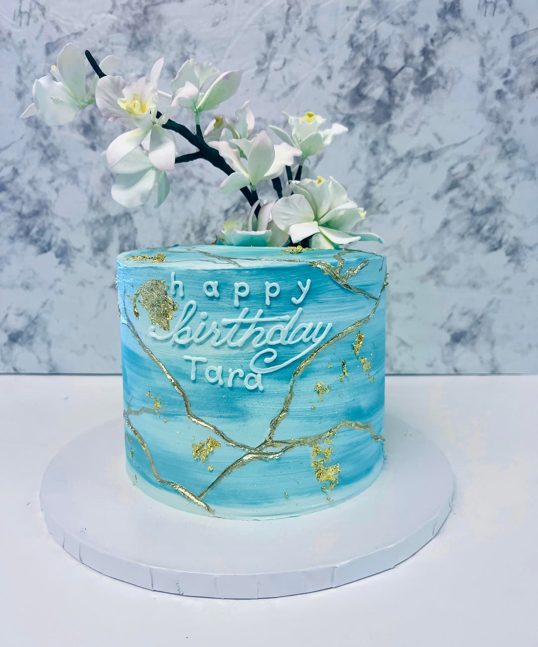
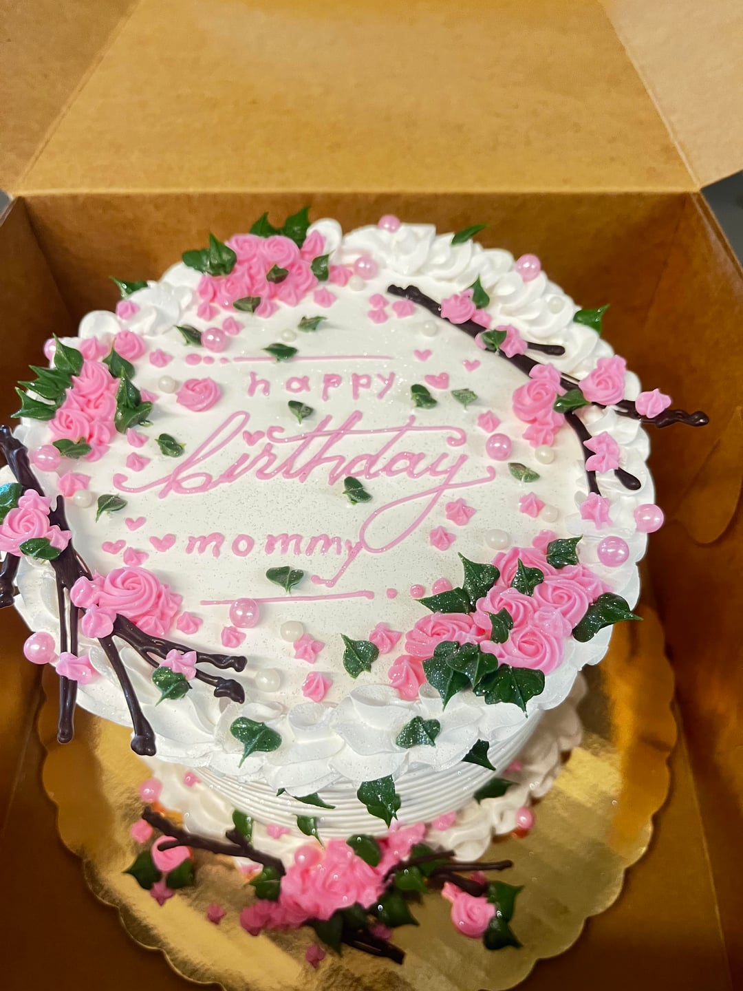
Those are great, very minor complaint, but only improvement I think you could make is you could capitalize the H in Happy.
Your lettering is excellent
Maybe separate the Y in birthday from the A in Tara? I originally read it as Happy Birthday Tard lmao otherwise your cakes are literally goals.
Your lettering is fine, but your space planning is off for Tara and mommy. You want the letters to be evenly spaced, and the lines to remain straight across, not go up or down.
These are beautiful cakes and at the time I bet know one was thinking how they could make them better! Enjoy your cake making!!
The first one has a Harry Potter feel and I want it
These are lovely, maybe a few could have been edited down a bit.
I really like the lettering. I have family who designs logos and it looks a little like that. Or store signs. I think you could experiment taking the lettering further that direction.
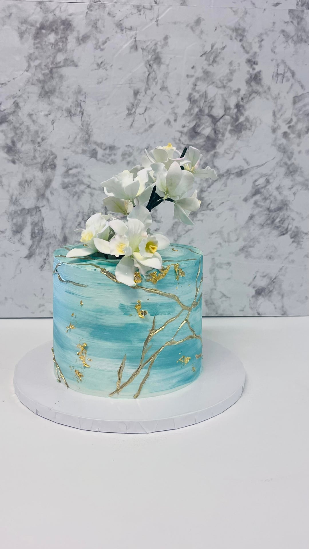
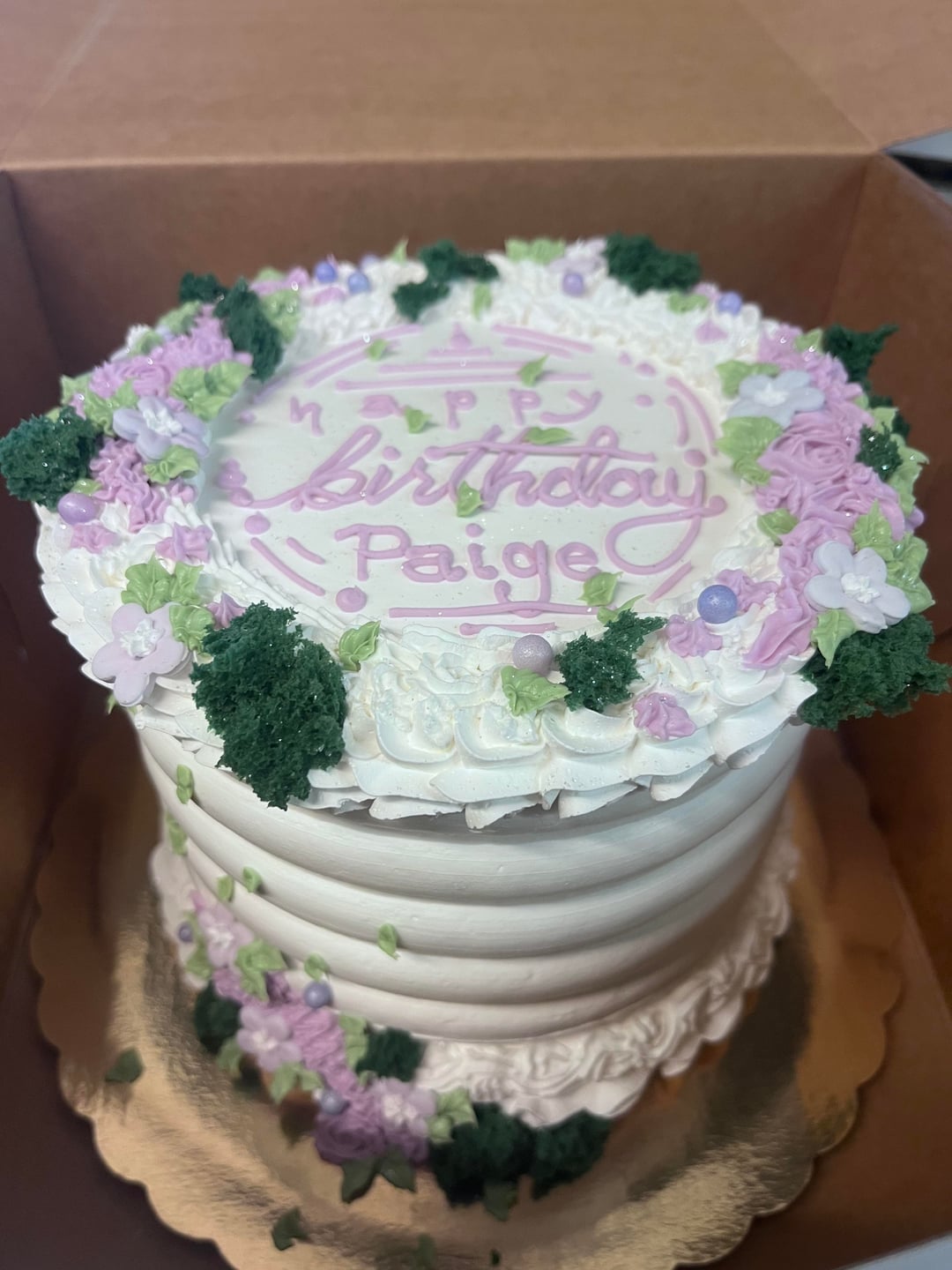
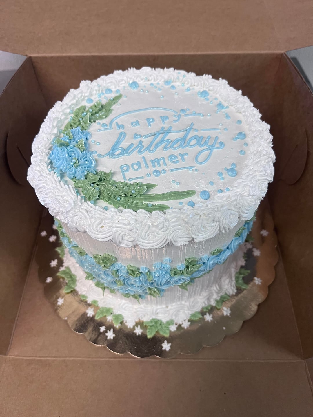
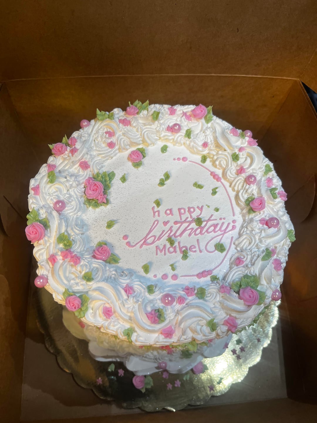
For the decorations, I rather like the style, it feels like vines with flowers on them as opposed to other people’s cakes feeling like a bouquet. Or like a photo of a field from afar as opposed to a portrait photo of a flower. This is why the sky-like cake works also. I think you can cultivate this as your personal style and find more ways to strategically place small flowers/leafs/stars etc. The cake for Mabel is the best example of what I’m talking about.
I don’t think you need to view this as feminine or soft, you can do your thing but the theme can be a garden or a greenhouse or a coral reef.
This is beautiful
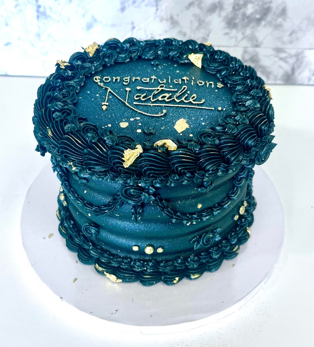
I am no baker (but a baker appreciator), but I gotta say that the teal color on the first cake is absolutely gorgeous!
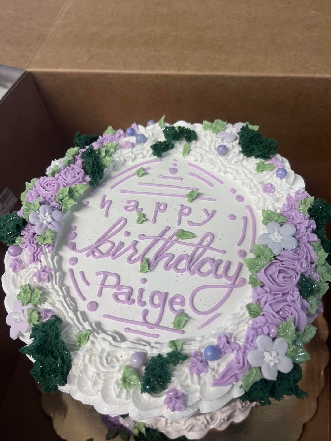
You’re lettering is fantastic, as others have said. And you’re really talented with your piping too! In my opinion, the cakes are maybe a bit too busy, everywhere. If I wrote that beautifully, I would want to draw attention to that with maybe one or two other design elements. But .. that is total nit-picking because … just wow
I’ve never seen birthday cakes so unique, while still being classic and beautiful?? They have a very compelling sort of charisma about them.
These are beautiful and your lettering is amazing!
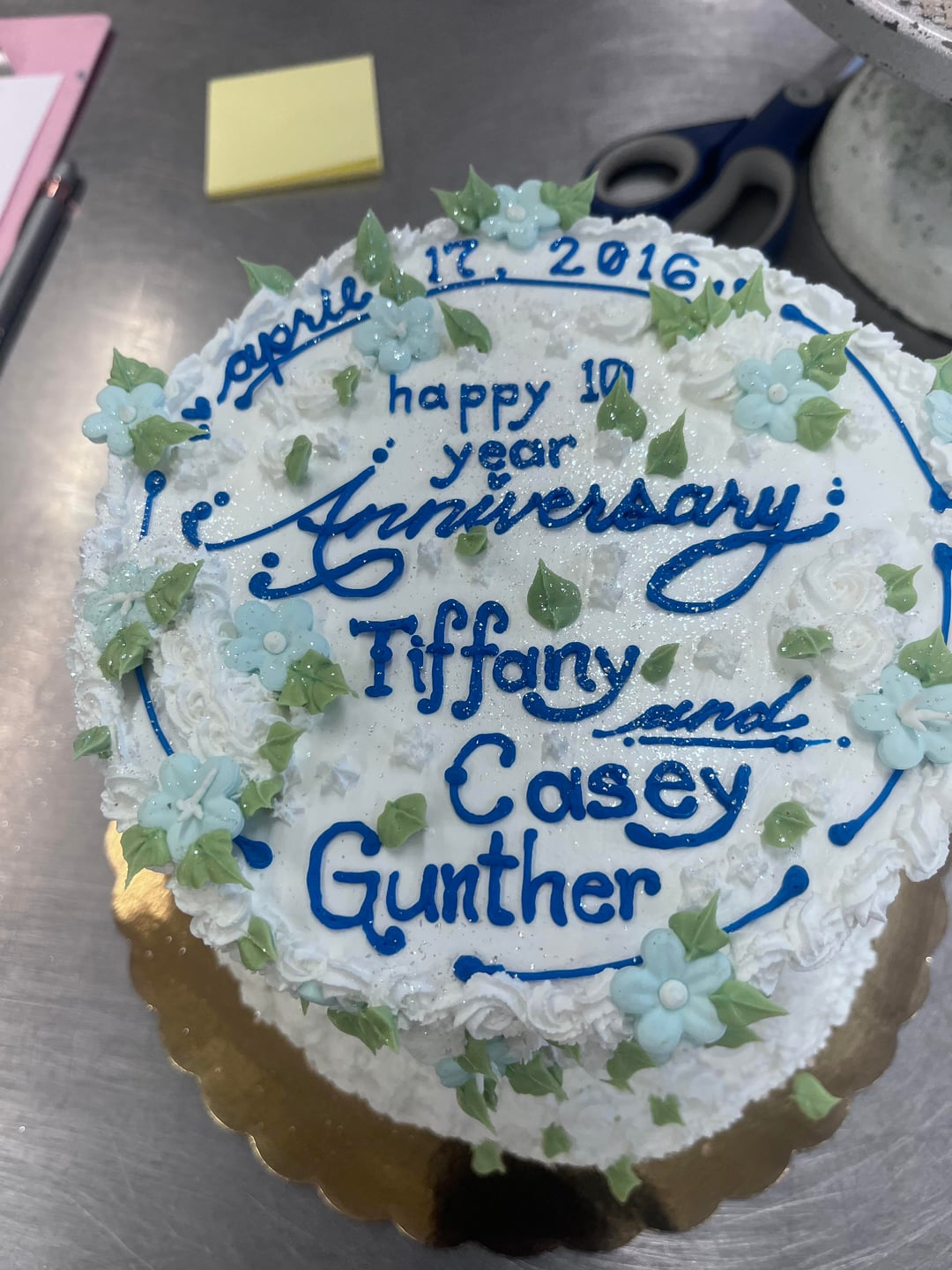
One thing that *immediately* cheapens the look of a cake is sloppy lettering. Work on proper spacing of letters and consistency of the amount of gel in the letter. Some of the lettering has globs of gel.
Most beautiful cakes ever! Your in depth lettering is really pretty flawless…I can’t imagine how you could improve them.
Love the first blue cake labeled for Tara! So pretty!
Wow, I really love your lettering. It’s so unique in a really good way.