Not an expert, but maybe the dish would pop up more in a darker plate?
bilboberman
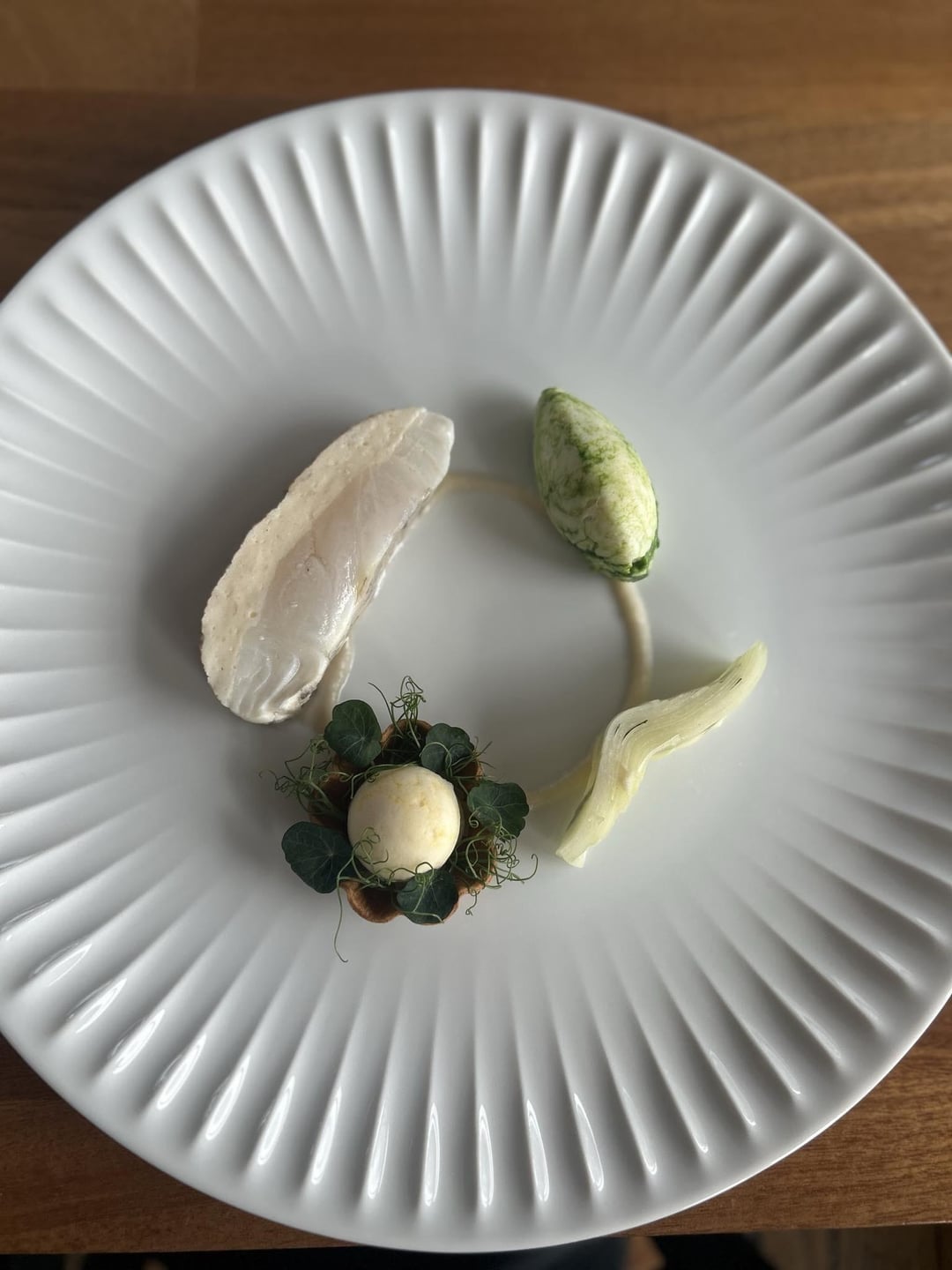
Is that fish with a fish mousse?
Onlineidsuck
Second looks better for sure but maybe turn the white thing which looks like fennel but probably wrong, maybe a little more inward so all the shapes don’t just form a rectangle and looks a bit less artificial but still looking structured.
therealdxm
How am I supposed to eat this? Do all of the components go together? Or feels very spare/disconnected and comes off pretty pretentious if I’m honest. Agree that a darker plate would help with contrast since most elements are pale
SCP-fan-unkillable
The plate looks too much like a paper plate for me to pay attention to the food.
nshait
I think the second pic is lovely and doesn’t need any editing. I would be very happy to receive this dish.
getrichordiefryin
Hey,
Honestly don’t listen to these guys.
I see a lot of technique here. It looks fantastic, I could absolutely see myself enjoying this as a part of a tasting course. Lovely work on the oil. This is a fine dining plate 100%.
Can a black plate within your theme? I think everything would pop a little more, showcasing all the hard work you did.
iwasinthepool
What is it?
Cooknbikes
Maybe some bright red chili oil. It looks kinda flat to me. How’s it taste. Maybe some kinda crunchy. Looks like poached/steamed fish an boiled greens


9 Comments
Not an expert, but maybe the dish would pop up more in a darker plate?
Is that fish with a fish mousse?
Second looks better for sure but maybe turn the white thing which looks like fennel but probably wrong, maybe a little more inward so all the shapes don’t just form a rectangle and looks a bit less artificial but still looking structured.
How am I supposed to eat this? Do all of the components go together? Or feels very spare/disconnected and comes off pretty pretentious if I’m honest. Agree that a darker plate would help with contrast since most elements are pale
The plate looks too much like a paper plate for me to pay attention to the food.
I think the second pic is lovely and doesn’t need any editing. I would be very happy to receive this dish.
Hey,
Honestly don’t listen to these guys.
I see a lot of technique here. It looks fantastic, I could absolutely see myself enjoying this as a part of a tasting course. Lovely work on the oil. This is a fine dining plate 100%.
Can a black plate within your theme? I think everything would pop a little more, showcasing all the hard work you did.
What is it?
Maybe some bright red chili oil. It looks kinda flat to me.
How’s it taste.
Maybe some kinda crunchy.
Looks like poached/steamed fish an boiled greens