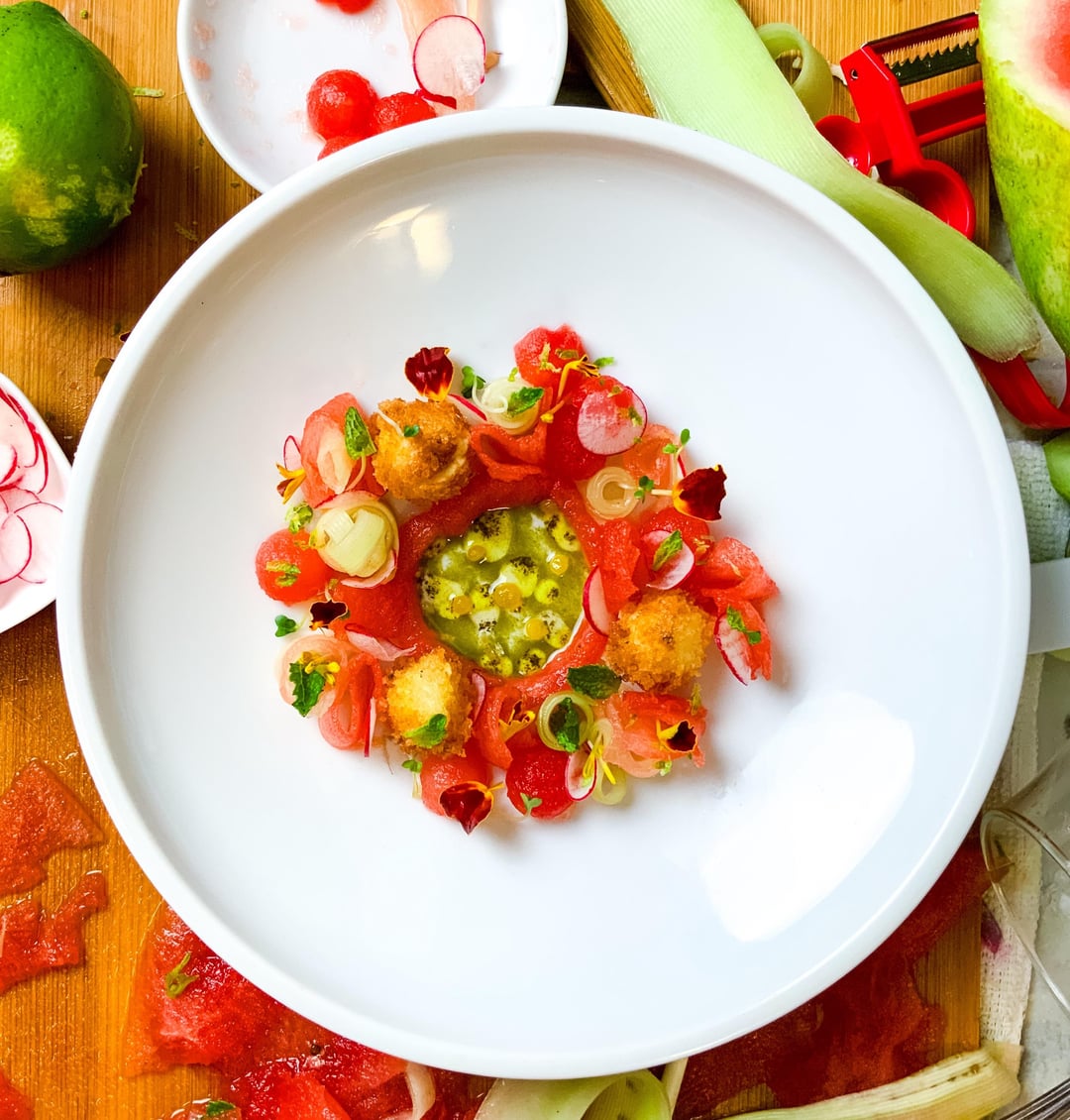
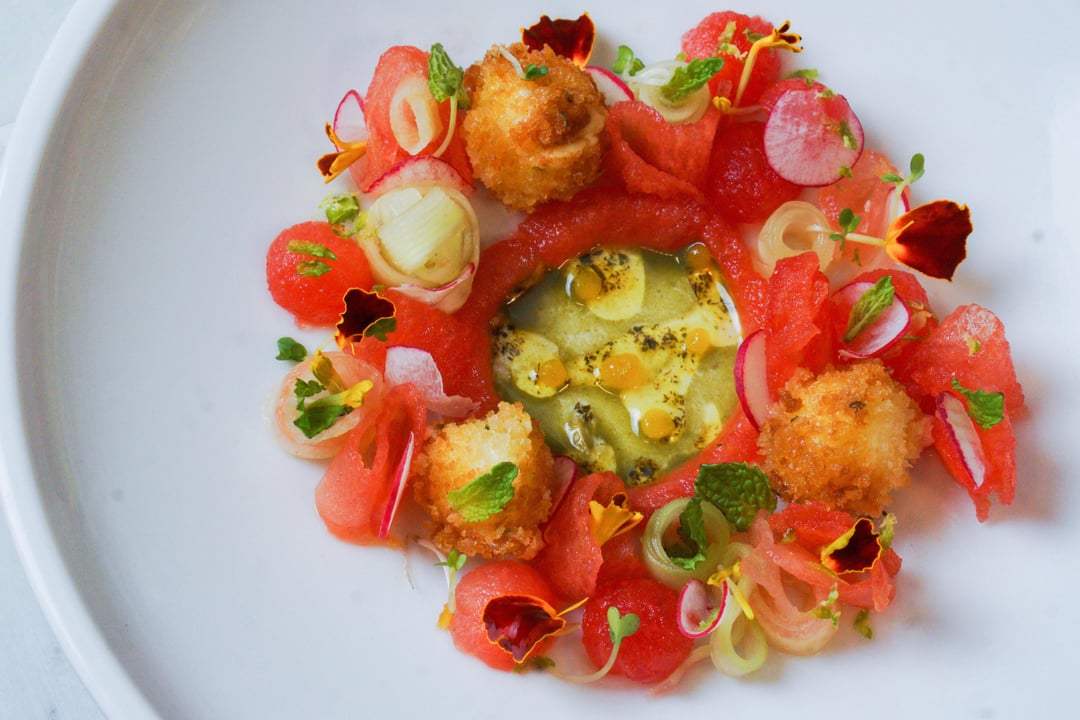
Watermelon and feta salad, lemon spheres, mint oil
M
by Parmesan28
10 Comments
Antbai11
I love the presentation, the colors and attention to detail. Although, I wish the food was placed in the middle of the dish instead of slightly to the left. It doesn’t feel intentional.
This is a very pretty dish, can tell a lot of care was taken plating, and the colours really been thought about. Like another comment said I’d like it to be in the middle of the plate to ease the ocd😂 Gotta ask tho, what’s a lemon sphere?
thenickdyer
This is visually overwhelming, there is no place my eye wants to focus. Try paring it back a bit with fewer of each ingredient.
drippingdrops
Genuine question: I get wanting the mint flavor profile but is an oil the way to go about it? Feta is already fatty and it seems the water content of the watermelon is high enough that oils will have a hard time adhering to it.
I dunno, coffee’s kicking in…
awesometown3000
This is just too busy. Stop overthinking your presentation and think more about how each bit works harmoniously for the person eating the dish.
StrangeArcticles
I feel like this needs to be either centred or moved off centre more so it looks like it’s deliberate. As is, it looks like you’ve spent much energy on detail work that is kinda getting lost cause I’m so distracted by where you positioned the food on the plate.
jsnamaok
Sorry but the middle looks like a pool of snot lol. Not very appealing.
chychy94
Is this just to be pretty? Because if this was on a menu, it would be a nightmare to pick up unless you have a 50 intern team at a Michelin star restaurant.

10 Comments
I love the presentation, the colors and attention to detail. Although, I wish the food was placed in the middle of the dish instead of slightly to the left. It doesn’t feel intentional.
I sure like it a lot better than this similar plate that was posted recently: https://old.reddit.com/r/CulinaryPlating/comments/1mqojla/goat_cheese_and_watermelon/n8tfeuc/
This is a very pretty dish, can tell a lot of care was taken plating, and the colours really been thought about. Like another comment said I’d like it to be in the middle of the plate to ease the ocd😂
Gotta ask tho, what’s a lemon sphere?
This is visually overwhelming, there is no place my eye wants to focus. Try paring it back a bit with fewer of each ingredient.
Genuine question: I get wanting the mint flavor profile but is an oil the way to go about it? Feta is already fatty and it seems the water content of the watermelon is high enough that oils will have a hard time adhering to it.
I dunno, coffee’s kicking in…
This is just too busy. Stop overthinking your presentation and think more about how each bit works harmoniously for the person eating the dish.
I feel like this needs to be either centred or moved off centre more so it looks like it’s deliberate. As is, it looks like you’ve spent much energy on detail work that is kinda getting lost cause I’m so distracted by where you positioned the food on the plate.
Sorry but the middle looks like a pool of snot lol. Not very appealing.
Is this just to be pretty? Because if this was on a menu, it would be a nightmare to pick up unless you have a 50 intern team at a Michelin star restaurant.
Very Michel Bras ca. late 90’s – early 2000’s