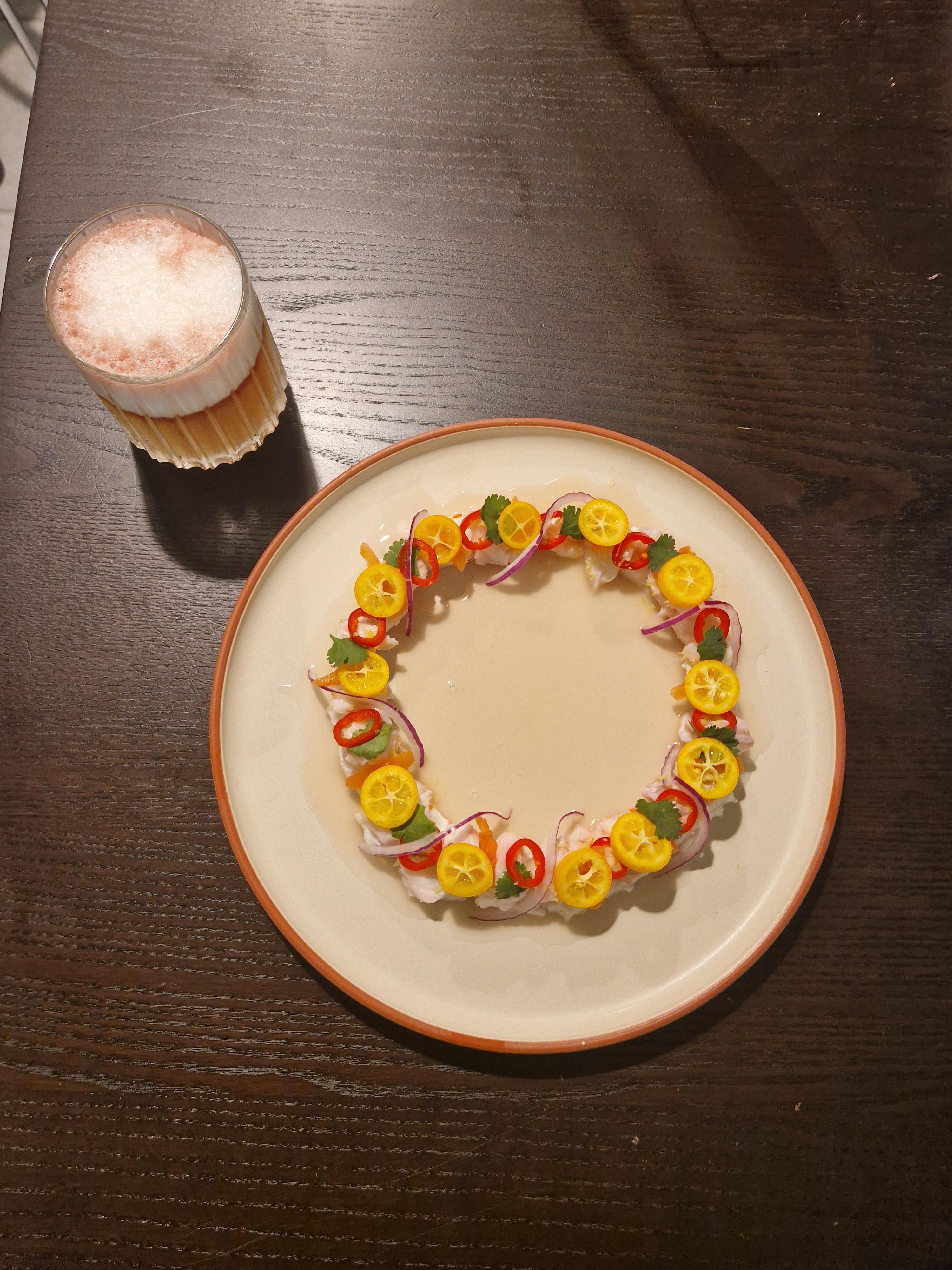
That looks like a lot of fairly thick cut citrus fruit.
Hieronymus-Hoke
Looks like embroidery in a hoop it’s so perfect!
Interesting-Goose568
It’s pretty but I think it looks so empty in the middle, maybe some drops of leche de Tigre with garnish?
griffs24
the fresnos, citrus, and red onion is going to totally overpower the actual flavor of the fish.
dathomasusmc
The ceviche is well done but I agree the negative space in the middle should be used. Even if it’s a simple garnish of flowers, just something to use up the space.
A_Sneaky_Walrus
I love the negative space in the middle. Don’t fill it like people are suggesting
jorateyvr
It’s driving me nuts that the ring is off center
Davethehippie-
Looks great! I think the only reason people are saying to fill in the center is because it’s large, I think if you made it 25% smaller nobody would have said anything
RedditModsRBigFat
It’s missing a drizzle of oil or a sprinkle or dusting of some kind. The individual components look too plain


9 Comments
That looks like a lot of fairly thick cut citrus fruit.
Looks like embroidery in a hoop it’s so perfect!
It’s pretty but I think it looks so empty in the middle, maybe some drops of leche de Tigre with garnish?
the fresnos, citrus, and red onion is going to totally overpower the actual flavor of the fish.
The ceviche is well done but I agree the negative space in the middle should be used. Even if it’s a simple garnish of flowers, just something to use up the space.
I love the negative space in the middle. Don’t fill it like people are suggesting
It’s driving me nuts that the ring is off center
Looks great! I think the only reason people are saying to fill in the center is because it’s large, I think if you made it 25% smaller nobody would have said anything
It’s missing a drizzle of oil or a sprinkle or dusting of some kind. The individual components look too plain