I love this. It’s pretty & choc/hazelnut is a favorite of mine.
LalalaSherpa
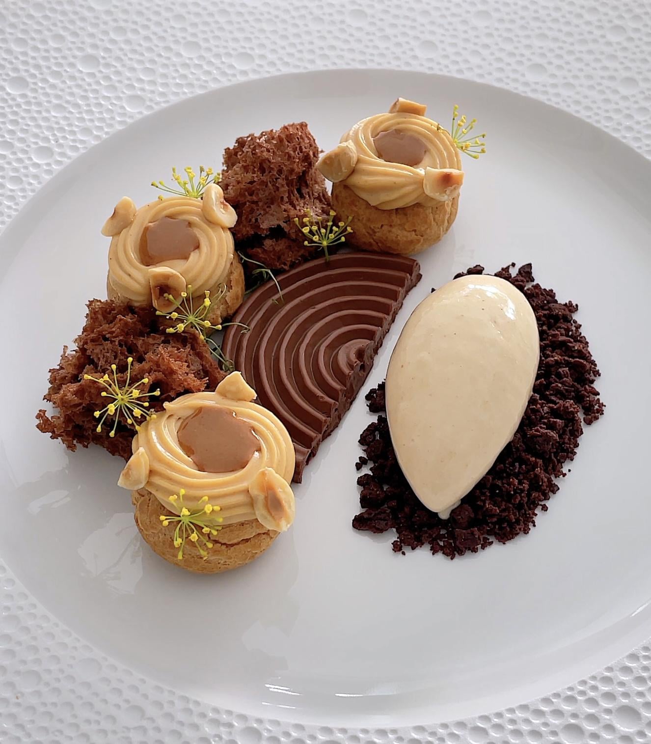
Shows off lots of techniques which is awesome and I like the unusual use of tiny flowers.
Yet the actual presentation seems self-consciously symmetrical and formal – the alternating creampuffs, etc.
For me the visual appeal would be greater if the plating were less structured, instead a tad more relaxed.
Also feels like each element has ‘main character syndrome’ – no obvious focal point.
sdric
Individually it looks great, but that cut makes it seam as if you had cut a meal into two and only gave that customer half of it. Try to hide the cut and turn the plate 90° so that you have a top and a botton rather than two different 2 halves. It might be artistic as is, but I dare say that most customers wouldn’t fully appreciate it visually as is.
EspasaPatina
Looking good, some pointers: Get the icecream colder, the icecream is too flat Less crumble Toast the hazelnuts Maybe some sauce over the cremeux dripping into the middle, or spray it with chocolate for a more interesting texture
Not bad as is though, but always improvements to be made
Parking_Ad_3307
my only complaint is the darkness of the choc soil in comparison to the rest of the
itsquacknotquack
I would *juuuuuust* angle the right side atop the middle swirl, just so it points diagonally to the bottom right. It would look really pretty.

7 Comments
I love this. It’s pretty & choc/hazelnut is a favorite of mine.
Shows off lots of techniques which is awesome and I like the unusual use of tiny flowers.
Yet the actual presentation seems self-consciously symmetrical and formal – the alternating creampuffs, etc.
For me the visual appeal would be greater if the plating were less structured, instead a tad more relaxed.
Also feels like each element has ‘main character syndrome’ – no obvious focal point.
Individually it looks great, but that cut makes it seam as if you had cut a meal into two and only gave that customer half of it. Try to hide the cut and turn the plate 90° so that you have a top and a botton rather than two different 2 halves. It might be artistic as is, but I dare say that most customers wouldn’t fully appreciate it visually as is.
Looking good, some pointers:
Get the icecream colder, the icecream is too flat
Less crumble
Toast the hazelnuts
Maybe some sauce over the cremeux dripping into the middle, or spray it with chocolate for a more interesting texture
Not bad as is though, but always improvements to be made
my only complaint is the darkness of the choc soil in comparison to the rest of the
I would *juuuuuust* angle the right side atop the middle swirl, just so it points diagonally to the bottom right. It would look really pretty.
Hazelnut ice cream is basically the best flavor.